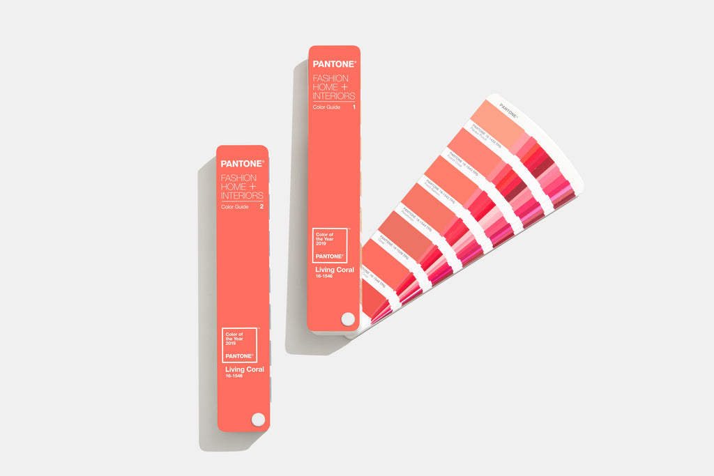
The time has come: PANTONE has announced the Color of the Year 2019! The color chosen for 2019 was Living Coral, an animating and life-affirming orange that envelops us with warmth and nourishment to provide us with comfort and momentum in our ever-changing environment.
PANTONE 16-1546 Living Coral
A stark contrast to last year's Ultra Violet, Living Coral focuses on environmental conservation and specifically the beauty of nature, such as coral reefs. At the center of our naturally vibrant and chromatic ecosystem, PANTONE 16-1546 Living Coral vividly demonstrates how coral reefs contain a diverse array of colors.

“Color inspires and influences the way we experience life,” says Laurie Pressman, Vice President of the Pantone Color Institute. “A life-affirming hue that is simultaneously vitalizing and nourishing, PANTONE 16-1645 Living Coral is a powerful example of how color influences our collective perception and reflects our current global culture.”
With the increasing use of digital technologies in our daily lives, we are constantly striving for authentic and immersive experiences that ensure relationships and intimacy. The engaging nature of PANTONE 16-1546 Living Coral embodies the human and engaging vibrancy that expresses our desire for playfulness.
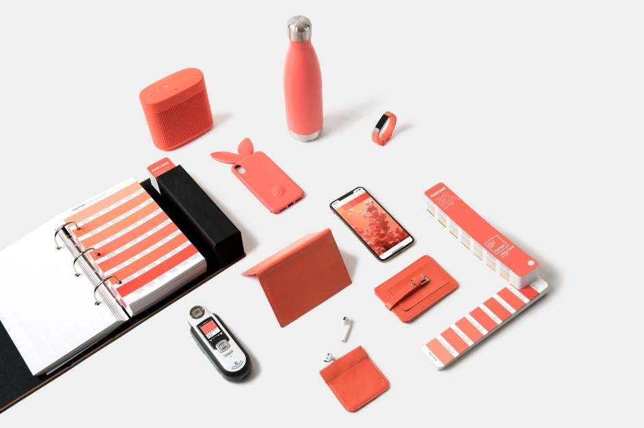
PANTONE 16-1546 Living Coral will influence product development and purchasing decisions in several industries in 2019 – including interior, fashion and industrial design as well as product, packaging and graphic design!
Order your PANTONE Color Guide with 16-1546 Living Coral here