Farben werden selten unter perfekten Bedingungen wahrgenommen. Ein Farbton, der im Showroom ausgewählt wurde, kann an der Wand plötzlich völlig anders wirken. Ein Stoffmuster kann je nach Raum von warm zu kühl wechseln. Verpackungen sehen unter Studiobeleuchtung anders aus als später im Einzelhandel. Die Farbe selbst hat sich nicht verändert – aber das Licht um sie herum schon.
Genau das ist eine der größten Herausforderungen in Design, Innenarchitektur, Branding und Produktion. Zu verstehen, warum das passiert, ist der erste Schritt, um damit gezielt umzugehen.
Licht ist ein Teil der Farbe
 Farben wirken oft wie etwas Festes und Unveränderliches. Tatsächlich hängt unsere Wahrnehmung jedoch vollständig vom Licht ab, das auf sie fällt. Lichtquellen unterscheiden sich vor allem in zwei Punkten: Farbtemperatur und Lichtqualität.
Die Farbtemperatur wird in Kelvin (K) gemessen und beschreibt, wie warm oder kühl eine Lichtquelle erscheint. Eine klassische Glühbirne liegt bei etwa 2700K und erzeugt ein warmes, leicht bernsteinfarbenes Licht, das Gelb-, Orange- und Rottöne betont. Ein helles LED-Bürolicht liegt oft bei 5000K oder darüber und erzeugt ein kühleres, bläuliches Licht, wodurch dieselbe Farbe schärfer, grauer oder sachlicher wirken kann. Auch Tageslicht verändert sich im Laufe des Tages – wärmer bei Sonnenauf- und -untergang, neutraler und kühler zur Mittagszeit.
Der zweite Faktor ist die Farbwiedergabequalität, gemessen mit dem Colour Rendering Index (CRI). Eine Lichtquelle mit hohem CRI-Wert (nahe 100) gibt Farben ähnlich präzise wieder wie natürliches Tageslicht. Lichtquellen mit niedrigem CRI – wie manche Leuchtstoffröhren oder günstige LEDs – können Farben hingegen abflachen oder verfälschen. Zwei Räume mit gleicher Helligkeit können dieselbe Farbe vollkommen unterschiedlich wirken lassen, wenn ihre CRI-Werte stark voneinander abweichen.
Das bedeutet: Eine Farbe, die in einem Farbfächer, auf einem Foto oder Bildschirm ausgewählt wurde, sieht nicht zwangsläufig in jeder Umgebung gleich aus. Ein sanfter Neutralton kann unter warmem Licht cremig wirken, unter schlechter Beleuchtung flach und leblos erscheinen oder unter hellen weißen LEDs kühl und architektonisch wirken.
Wenn dieselbe Farbe plötzlich wie zwei verschiedene aussieht
 Einer der eindrucksvollsten Effekte variabler Beleuchtung ist das sogenannte Metamerie-Phänomen. Dabei wirken zwei Farben unter einer Lichtquelle identisch, unterscheiden sich jedoch deutlich unter einer anderen.
Das passiert, weil Farben durch unterschiedliche Pigment- oder Farbstoffkombinationen entstehen können, die Licht jeweils anders absorbieren und reflektieren. Unter einer bestimmten Lichtquelle bleiben diese Unterschiede unsichtbar. Ändert sich das Licht, wird die Abweichung plötzlich sichtbar. Eine Lackierung, die im Showroom perfekt zu einem Stoff passt, kann im Raum unter Abendlicht deutlich anders wirken. Ein gedrucktes Etikett, das unter Studiobedingungen exakt zum Produkt passt, kann unter Lagerbeleuchtung plötzlich abweichen.
Für Designer, Hersteller und alle, die mit farbkritischer Produktion arbeiten, ist Metamerie ein reales und praktisches Problem. Es handelt sich nicht um einen Fehler eines einzelnen Produkts, sondern um eine Folge des Zusammenspiels von Licht und Materialien.
Dieselbe Farbe, unterschiedliche Räume
 Neben den physikalischen Eigenschaften von Lichtquellen beeinflusst auch die Umgebung selbst die Farbwahrnehmung. Ein nach Norden ausgerichteter Raum in Großbritannien erhält den Großteil des Tages indirektes, kühleres Tageslicht. Farben wirken dort meist kühler und leicht grauer als in einem südlich ausgerichteten Raum mit direkter Nachmittagssonne. Innenarchitekten empfehlen deshalb häufig, Wandfarben zu unterschiedlichen Tageszeiten direkt im jeweiligen Raum zu testen – denn ein warmer Off-White-Ton kann am Nachmittag plötzlich kühl und flach erscheinen.
Im Einzelhandel kommt eine weitere Ebene hinzu. Beleuchtung wird dort selten neutral gewählt – sie wird gezielt eingesetzt, um Produkte attraktiver wirken zu lassen. Warmes Spotlicht in Modegeschäften schmeichelt Hauttönen und lässt Stofffarben satter wirken. Helles weißes Licht im Supermarkt sorgt dafür, dass Obst und Gemüse frischer erscheinen. Wenn ein Verpackungsdesigner eine Etikettenfarbe unter Studiolicht freigibt, kann diese unter der LED-Beleuchtung im Regal später dennoch anders wirken. Solche Unterschiede sind oft subtil, können aber die visuelle Konsistenz einer Marke beeinträchtigen.
Die Herausforderung betrifft ebenso Produktfotografie, Showrooms, Messen und jede Umgebung, in der ein Design außerhalb seines finalen Kontexts bewertet wird.
Warum standardisierte Farbsysteme helfen
 All diese Beispiele weisen auf dasselbe Grundproblem hin: Farbe ist in ihrer Wahrnehmung nicht stabil. Sie hängt von Bedingungen ab, die sich ständig verändern und die niemand vollständig kontrollieren kann.
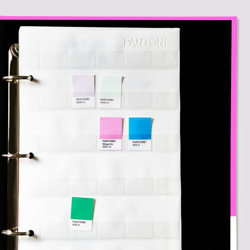
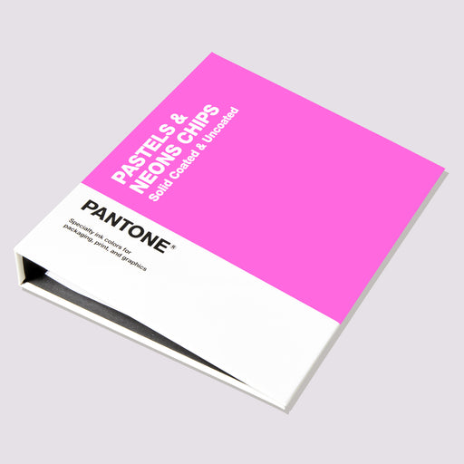
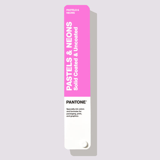
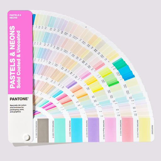
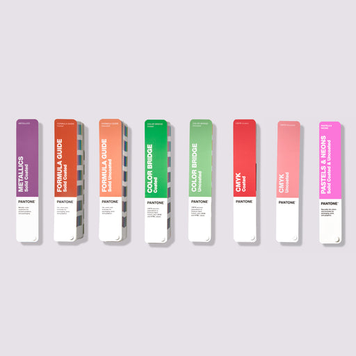
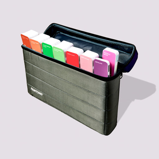
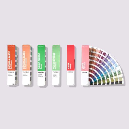
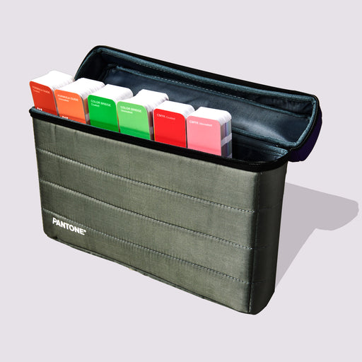
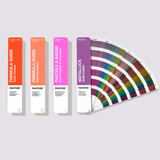
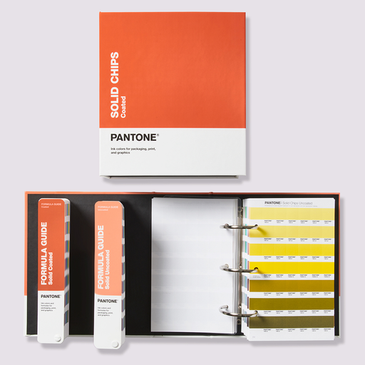
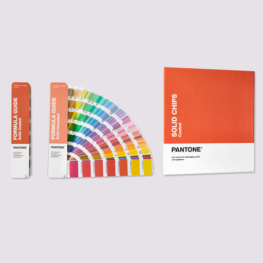
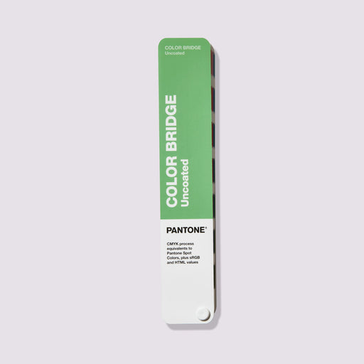
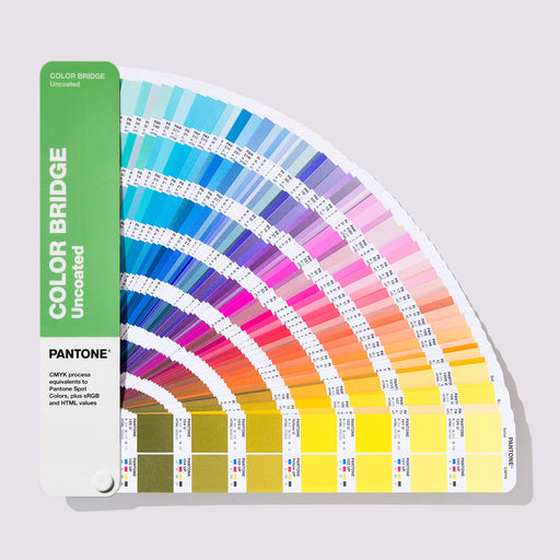
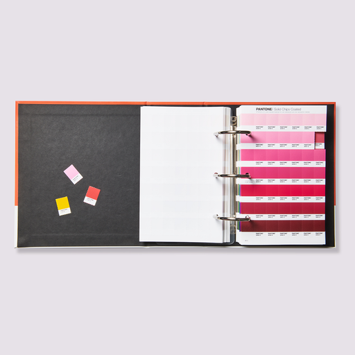
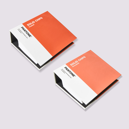
Genau deshalb gibt es standardisierte Farbsysteme. Physische Referenzen wie Pantone, RAL und NCS schaffen einen gemeinsamen, verlässlichen Bezugspunkt für Designer, Hersteller, Lieferanten und Kunden – unabhängig von Lichtverhältnissen oder Bildschirmen.
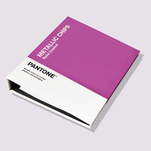
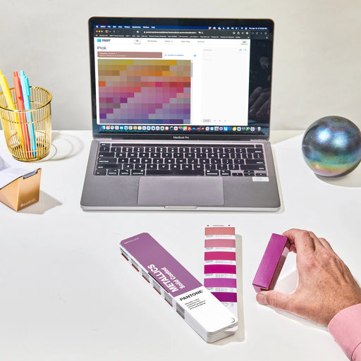
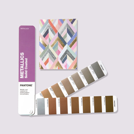
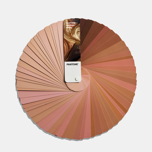
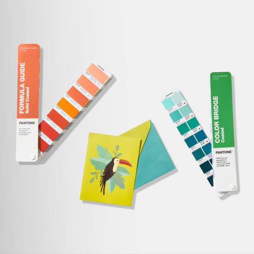
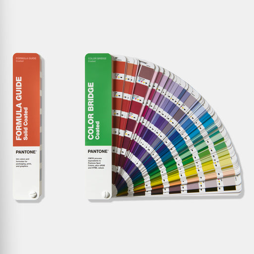
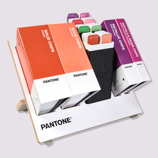
Pantone wird häufig in Branding, Druck, Verpackung und Produktdesign eingesetzt. Statt eine Farbe als „warmes Grau“ oder „staubiges Blau“ zu beschreiben, definiert eine Pantone-Referenz einen konkreten, reproduzierbaren Farbton, den eine Druckerei in einem Land genauso umsetzen kann wie ein Hersteller in einem anderen.
RAL wird vor allem bei architektonischen Beschichtungen, Pulverlackierungen, Beschilderung und industriellen Oberflächen verwendet, wo Konsistenz über große Flächen und lange Produktionsläufe hinweg entscheidend ist.
NCS, das Natural Colour System, basiert auf der menschlichen Farbwahrnehmung statt auf Pigmentmischungen oder Druckprozessen. Besonders in Architektur und Interior Design ist es hilfreich, da dort nicht nur wichtig ist, welche Farbe verwendet wird, sondern auch, wie sie im Raum wahrgenommen wird.
Keines dieser Systeme eliminiert den Einfluss von Licht vollständig. Eine Pantone-Farbe unter einer 2700K-Lampe wirkt weiterhin anders als dieselbe Referenz bei Tageslicht. Doch sie schaffen einen festen Bezugspunkt. Wenn Farben freigegeben, kommuniziert oder konsistent reproduziert werden müssen, beseitigen physische Farbstandards die Unsicherheit, die durch Licht, Bildschirme und subjektive Wahrnehmung entsteht.
Farben werden immer von ihrer Umgebung beeinflusst. Standardisierte Referenzen ändern das nicht. Sie sorgen jedoch dafür, dass alle Beteiligten mit demselben Ausgangspunkt arbeiten – unabhängig davon, wo sie sich befinden oder wie das Licht gerade wirkt.