At the beginning of 2020, there were once again the typical New Year’s resolutions:
getting fitter, an alcohol-free month, spending less time on screens; and since some New Year's resolutions are notoriously difficult to stick to, let's focus on the achievable ones that will bring us significant benefits in our everyday lives.
Color management can sometimes be forgotten, but it should be considered from the beginning, even before you take your picture, to ensure the result matches your expectations. Here we have summarized the top 5 color management habits that you should implement in 2020 and that will help you perfect your images and even save time and money in the process.
1. Set a custom white balance before shooting
White balance indicates how warm or cool the overall colors in your image look. If the white balance is not set correctly, it can cause your image to appear too warm or too cool. We recommend setting a custom white balance before shooting to save time in post-processing or finding a neutral reference point, and to ensure that the color temperature of your image has been adjusted to match the color temperature of the location where you shot.
2. Calibrate your monitor
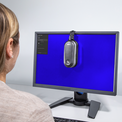
Calibrating your monitor is one of the essential aspects of color management. If you start editing images and your monitor is not displaying colors correctly, the chances of you being able to produce an image with the colors you captured are very slim! We recommend calibrating your monitor approximately every 2-6 weeks, as temperature and screen brightness gradually change over time, which can cause color shifts.
Some of our favorite monitor calibration tools include the X-Rite i1Display Studio , the X-Rite i1Studio , and the X-Rite i1 ColorChecker Photo Kit .
3. Find the ideal software for your needs


You have already purchased the right tools for your color management workflow. So the next step is to use industry standard software such as Adobe, Capture One and Affinity. Adobe Photoshop is perfect for retouching and composing work, as well as for image editing down to the pixel level.
Phase One software, Capture One, gives professional photographers the tools they need to develop top-quality images directly from RAW files.
Affinity Photo offers sophisticated tools to enhance and retouch your images with an incredibly intuitive user interface.
But basically it’s just about finding the software that best suits your needs!
4. Set up an area for evaluating prints
Whether you are working in a photo studio or at home, it is essential to work in a correctly lit room to avoid viewing your prints under extremely dark or bright lighting conditions. If possible, set up a viewing area with a light booth , designed for assessing work where natural light is often lacking. If a light booth is out of your budget, consider viewing prints using a daylight lamp, such as the GrafiLite , which allows you to view and assess prints and color samples under natural light at any time of day.
5. Invest in the right tools
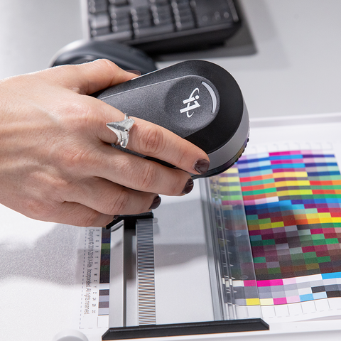
When it comes to color management, it is important to have the right tools to achieve the best possible results. Whether you have a small or large budget, it is important to choose the tools that are best for you, based on your budget and, most importantly, your needs. There are a number of tools that will help you achieve perfect results.
X-Rite 's calibration tools are designed for anyone serious about color management of their images - including a range of tools for photographers and digital imaging specialists who want to achieve consistent, accurate color from capture to screen playback to print.
Would you like to learn this color workflow?
Then we have the right tools for you.