Contact us
0800 776 2000
0800 776 2000

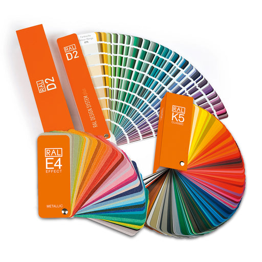
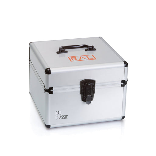
RAL Classic has been the established global standard for colours in public institutions and private industry for more than 100 years. It offers safety and signal colours as well as colours that comply with DIN standards . The 216 modern colours are used for colour checking for painters and coatings by interior designers and tradesmen. They are also used in the field of industrial design to communicate colours and standardise industrial processes.
What are DIN standards?
These are popular color standards that are regularly used by industries, for example in the color coding of telecommunications cables.


All 216 Classic colours, including key metallic, safety and signal colours, are presented on a single page, ideal for identifying and coordinating colours and communicating ideas between designers, architects and clients.
RAL K5 is available in semi-matt , glossy and
available as a two-booklet bundle .


This colour fan contains all 216 RAL CLASSIC colours, with five colours shown on each page. The RAL K7 is ideal as a quick reference for designers, architects and industrial customers to support decisions on site.


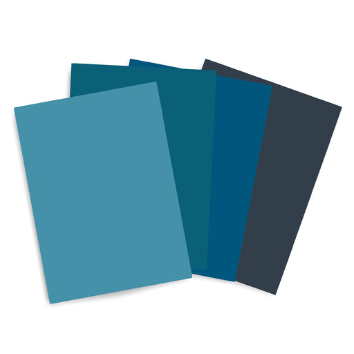
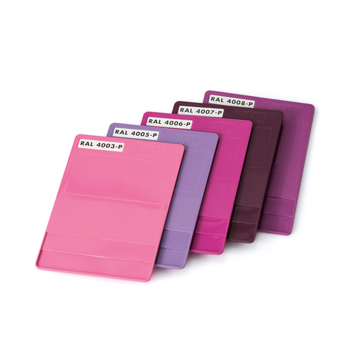
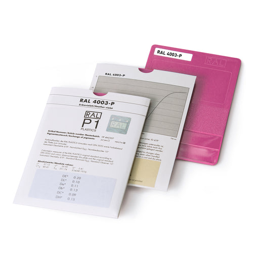
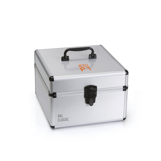
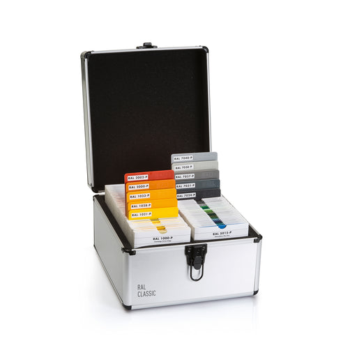
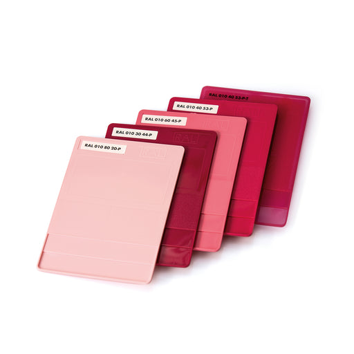
Use the RAL P1 Set to show the relationship between colour and material to customers and as a physical and tactile reference when matching colours from your RAL colour guide. Ideal for colour experts in architecture, product design and crafts, these polypropylene plastic samples offer three thicknesses and the highest colour saturation and luminosity for comparison.
RAL K5 color chart glossy - water-based The RAL K5 glossy color fan is a tried and tested tool for setting standards in color design. With all 2...
View full detailsRAL K5 color fan, semi-gloss - water-based The RAL K5 satin-finish color fan deck is a proven tool for setting standards in color design. Featur...
View full detailsRAL K7 The RAL K7 color fan showcases the wide spectrum of the renowned RAL CLASSIC color collection, featuring a total of 216 timeless and prov...
View full detailsRAL K5 color fan, semi-gloss - water-based The RAL K5 satin-finish color fan deck is a proven tool for setting standards in color design. Featur...
View full detailsRAL K7 The RAL K7 color fan showcases the wide spectrum of the renowned RAL CLASSIC color collection, featuring a total of 216 timeless and prov...
View full detailsRAL K5 color fan glossy - water-based The RAL K5 glossy color fan deck is a proven tool for setting standards in color design. Featuring all 216...
View full detailsRAL K5 color fan set - water-based The RAL K5 color fan deck is a proven tool for setting standards in color design. Featuring all 216 RAL CLASSIC...
View full detailsThis 3-in-1 bundle contains all RAL colors from the Classic, Effect and Design palettes and includes everything you need to determine colors. Enhan...
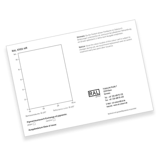
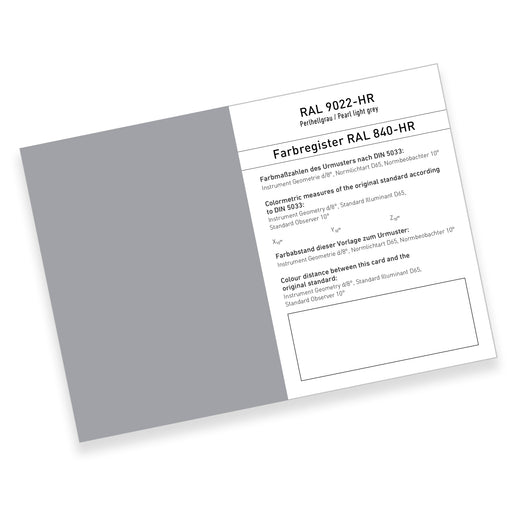
View full detailsRAL 840-HR single card The RAL 840-HR color register contains all 213 RAL CLASSIC colors in semi-matte. The cards are binding color references f...
View full detailsRAL A4 single pages This is a CtO product – terms and conditions apply. We present the RAL A4 color page collection! Elevate your colo...
View full detailsWith this RAL 2-in-1 bundle, you can select and customize a wide range of colors. With the RAL 2-in-1 bundle, you'll never run out of ideas, and yo...
View full detailsRAL A6 single pages This is a CtO product – terms and conditions apply. We present the RAL A6 single-page collection! Elevate you...
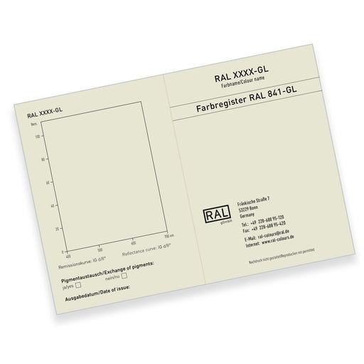
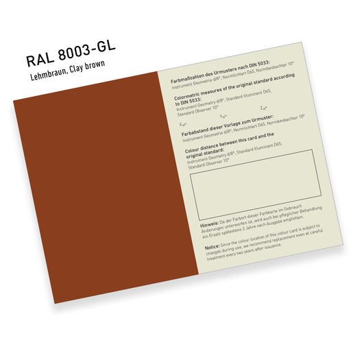
View full detailsRAL 841-GL single cards - high gloss The RAL 841-GL color register contains 196 RAL CLASSIC colors in high gloss. The cards are binding color re...
View full detailsRAL P1 Plastics System Single Chip The RAL color standard for plastics All RAL P1 color swatches are available individually. RAL P1 com...
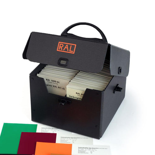
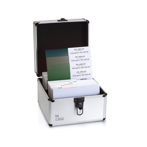
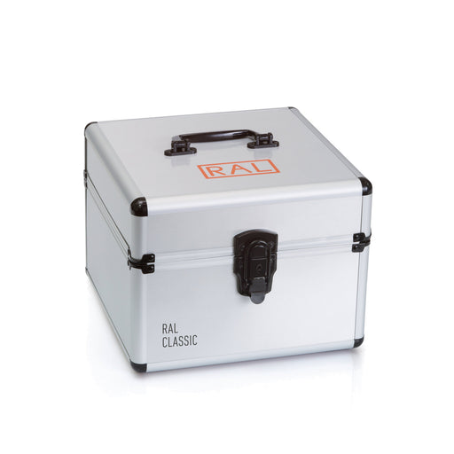
View full detailsPortable filing box for RAL840 & RAL841 A durable, protective, and portable box for your RAL840 and RAL841 color samples. This box serves to ...
View full detailsRAL P1 plastic system case With RAL P1, for the first time, 100 colors from the RAL CLASSIC color collection were transferred into an indepe...
View full detailsRAL 840-HR color register including protective box The RAL 840-HR color register contains all 216 RAL CLASSIC colors in semi-matte. The cards are...
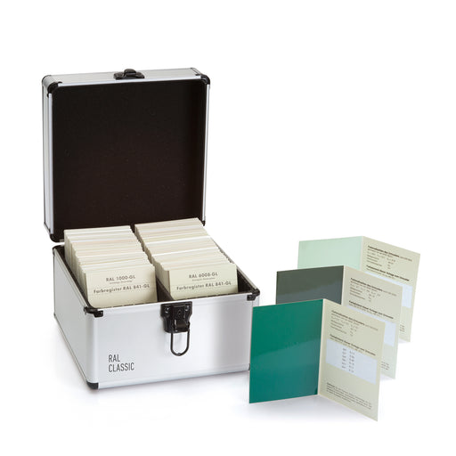
View full detailsRAL 841-GL color register The RAL 841-GL color register contains 199 RAL CLASSIC colors in high-gloss finish. The cards are binding color refere...
View full details
Water-based color cards with an aqueous coating system for environmentally friendly color production. These are ideal for paint and coatings manufacturers and find application in interior design, architecture, product design and graphic design.


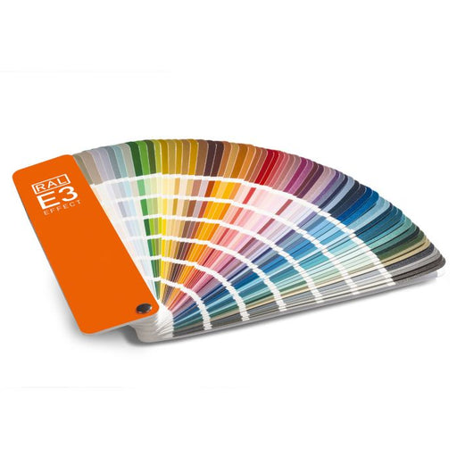
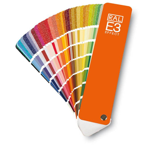
The RAL E3 is ideal for architects, designers and industrial applications to match colours and make decisions on-site with clients or in the studio. With seven colours per page, the colour fan shows 70 metallic shades against six corresponding solid colours to compare colour families and perfectly match materials.


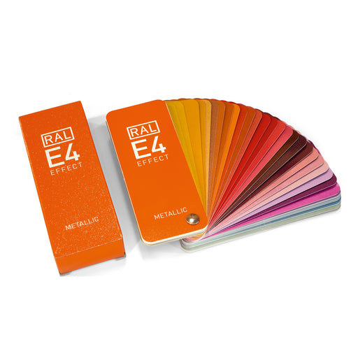
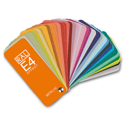
The RAL E4 shows 70 metallic colours as borderless single-page samples with high-quality surface coating. Ideal for architects, designers and manufacturers, the colour fan allows you to visualize and match metallic colours against materials and designs.
This 3-in-1 bundle contains all RAL colors from the Classic, Effect and Design palettes and includes everything you need to determine colors. Enhan...
View full detailsRAL EFFECT E4 (Metallic) color fan RAL EFFECT includes all 70 RAL EFFECT metallic shades based on acrylic paints and makes them available for t...
View full detailsRAL A6 single pages This is a CtO product – terms and conditions apply. We present the RAL A6 single-page collection! Elevate you...
View full detailsThe RAL E3 EFFECT color fan deck presents a mix of 420 solid colors and 70 metallic colors from the RAL EFFECT E3 color collection. It is an indis...
View full details
This comprehensive collection of 1,825 colors is an indispensable tool for creative professionals in architecture, design, industry and crafts. The Design System Plus colors are based on the CIELab system and are ideal for industrial and product design as well as for facilitating color communication, creativity and experimentation. With color names in English, German, French, Russian and Chinese for international collaboration.
What is the CIELab system?
CIELab stands for Commission Internationale de l'éclairage, or International Commission on Illumination, the international authority on light and color spaces. The CIELab color space represents colors as humans see them through brightness and the unique colors red, green, blue, and yellow, based on the results of color matching experiments conducted in the laboratory.


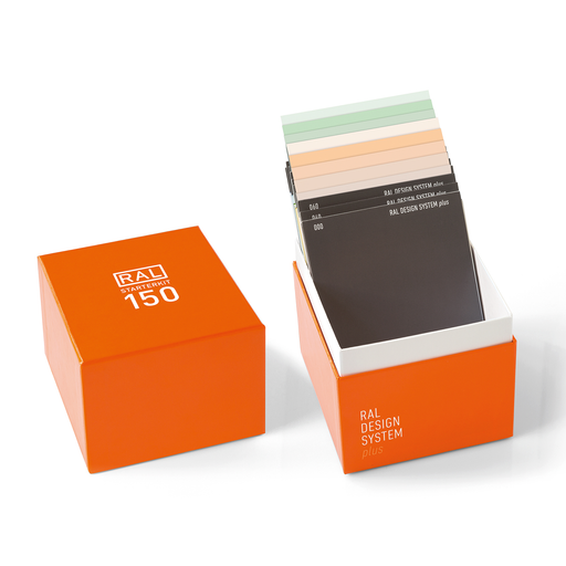
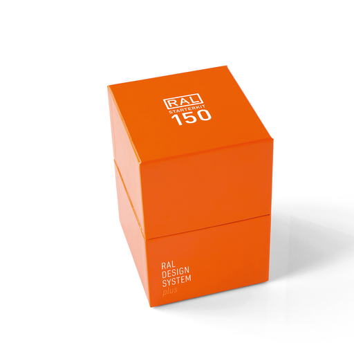
The RAL Starter Kit is a set of 150 pieces that contains a selection of 10 colours and gray tones from the DESIGN SYSTEM PLUS and popular wood tones from the CLASSIC range. Ideal for creating colour concepts for professional interior and product design.
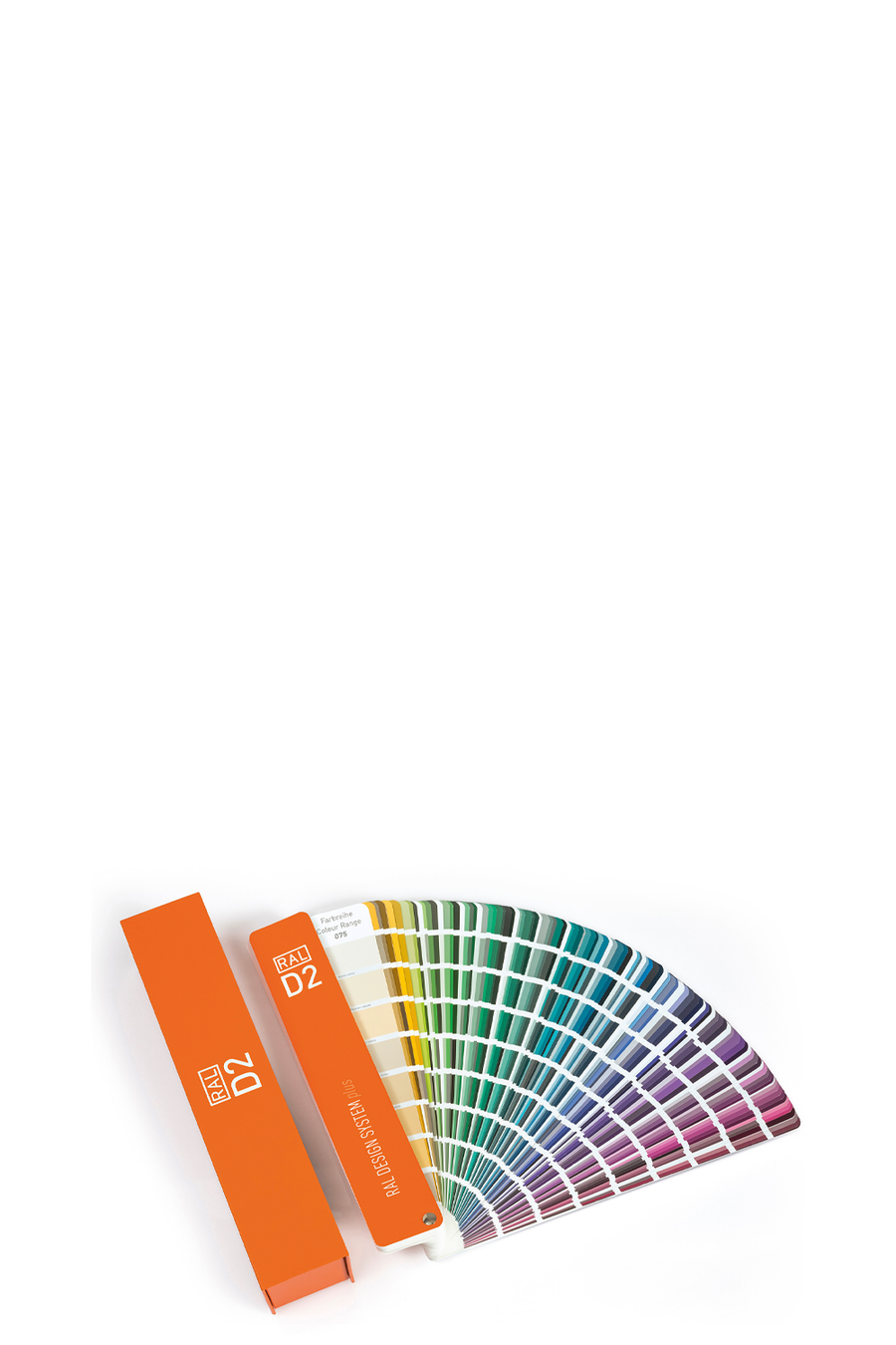
Quickly find colour combinations and compare hue, brightness and saturation with this chromatically organized 225-page colour fan deck with 1,825 colours and 30 separate colour palettes. View colours by translated colour name and HCL (Hue-Chroma-Luminance) code.
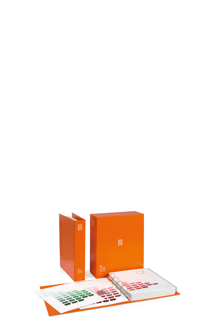
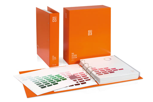
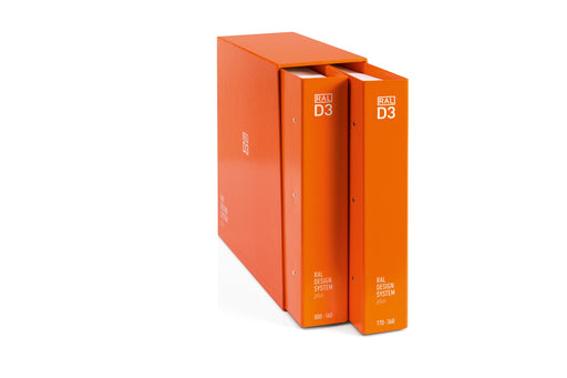
Create stunning mood boards, colour palettes and colour collections with this 40-page colour tool book, featuring 1,825 colours in the form of 1.25" x 1.5" removable colour swatches organised by hue.
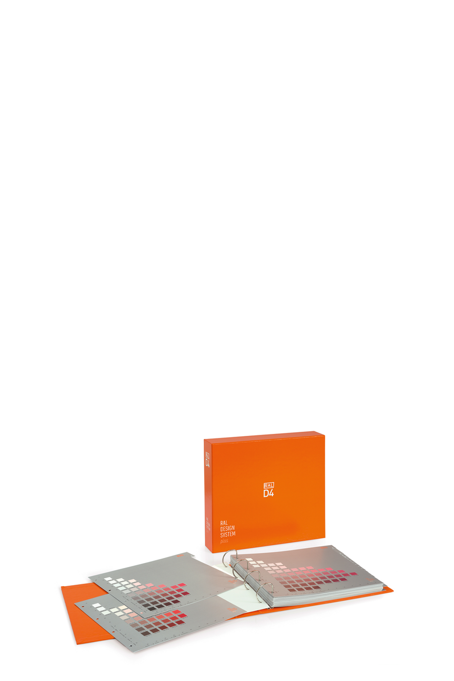
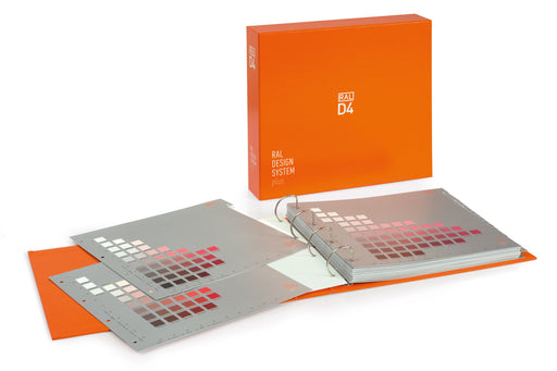
A systematic collection of 1,825 colour samples in a 40-page reference folder that visually represents the entire 3D colour space against a gray matte paper to avoid glare in colour perception. For creating colour sequences and trend palettes.
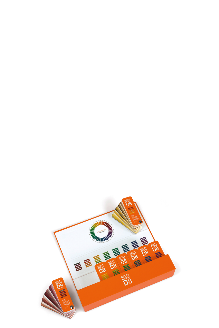
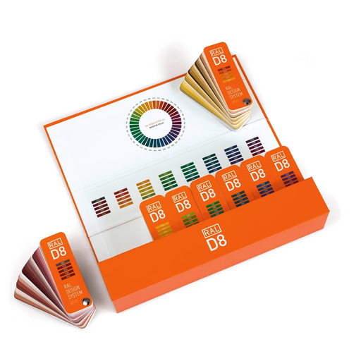
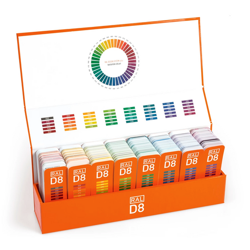
All 1,825 colours are contained in 8 practical colour fans, each with a specific colour space. Each colour is presented as a full-surface sample and is ideal for comparison and colour communication with customers on the go.


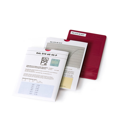
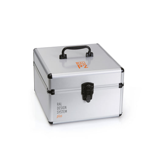
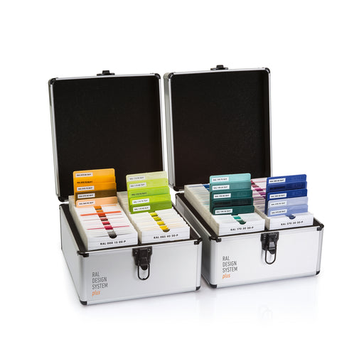
RAL P2 contains 160 Design System Plus colours as 200 A6 polypropylene plastic samples. It offers four opaque and one transparent shade for each of the 39 colour groups, as well as greyscales that make up the entire colour system. View colours and glossy, matt and rough textures in a tactile form in three different thicknesses. Ideal for design and manufacturing.
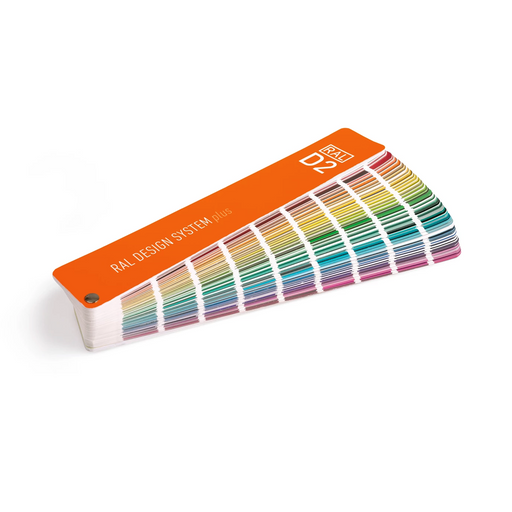
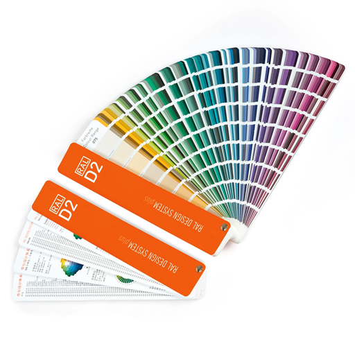
RAL D2 DESIGN color fan How do you get from the seven-digit RAL DESIGN color number to the corresponding color shade – and vice versa? The color fa...
View full detailsThis 3-in-1 bundle contains all RAL colors from the Classic, Effect and Design palettes and includes everything you need to determine colors. Enhan...
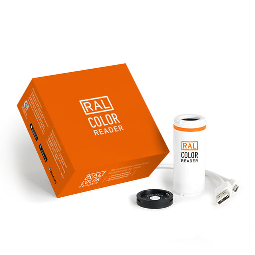
View full detailsRAL Colour Reader The RAL Colour Reader is a compact and precise colorimeter that provides users with a fast and reliable tool for color measurem...
View full detailsRAL A4 single pages This is a CtO product – terms and conditions apply. We present the RAL A4 color page collection! Elevate your colo...
View full detailsRAL A6 single pages This is a CtO product – terms and conditions apply. We present the RAL A6 single-page collection! Elevate you...
View full detailsWith this RAL 2-in-1 bundle, you can select and customize a wide range of colors. With the RAL 2-in-1 bundle, you'll never run out of ideas, and yo...
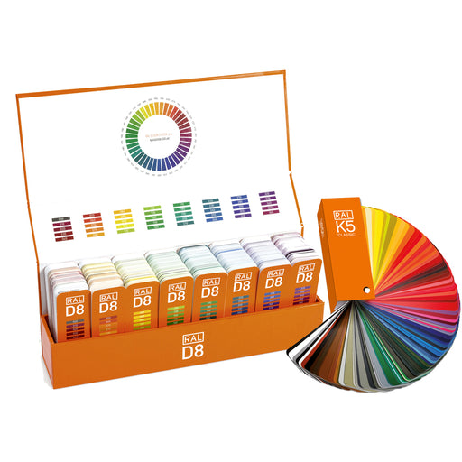
View full detailsRAL D8 DESIGN design box with 8 color swatches Do you want to help your customers find their desired color more quickly, or match colors on the co...
View full detailsRAL Starter Kit Design Box Are you looking for a quick yet systematic introduction to the RAL DESIGN SYSTEM plus? The 150-piece starter kit in D...
View full detailsRAL Trendbox 2027+ The RAL Trendbox is a versatile design tool that translates the 15 trend colors from the RAL COLOUR FEELING 2027+ trend report ...
View full detailsRAL P2 (DESIGN) Plastic single sheets - single chip RAL colors for the plastics industry: With the 200 color swatches of the RAL DESIGN SYST...
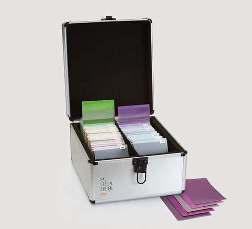
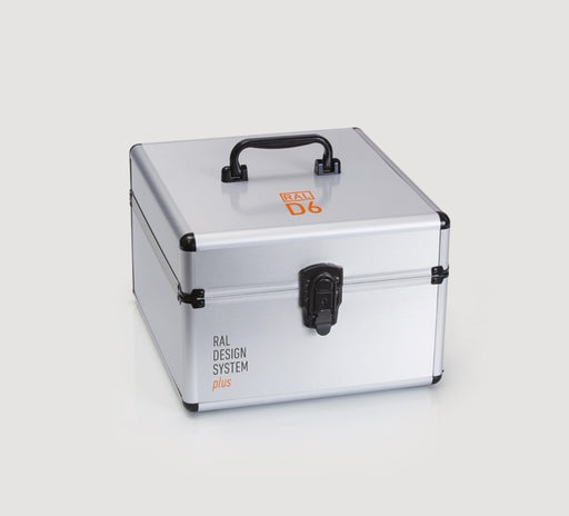
View full detailsRAL D6 Box Color code, shade, color information: The aluminum box containing the RAL DESIGN colors in DIN A6 format provides even greater clarity...
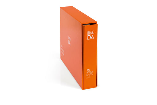
View full detailsRAL D4 Color Atlas Did you know that the RAL DESIGN SYSTEM is based on a 3D model? It organizes colors in three dimensions according to hue, brigh...
View full detailsD3 Colour Toolbook Ring Binder Which colors go together? With its removable color chips, the Colour Toolbook makes it easy to find the right shade...
View full detailsRAL P2 plastic system in two protective cases Cool petrol blue, lush leaf green, vibrant ochre, intense berry tones, and soft lilac bring new...
View full details


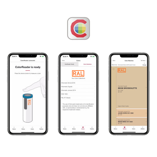
Free yourself from the frustration of spending hours trying to find the exact colour you saw and avoid misunderstandings throughout the process with the RAL Color Reader .
{"one"=>"Select 2 or 3 items to compare", "other"=>"{{ count }} of 3 items selected"}