Contact us
0800 776 2000
0800 776 2000
Turning the ideas that come along with them into reality can sometimes be difficult. Color plays an essential role in product development and determines the success of a product line. Starting with the right tools allows you to maintain the integrity of your creative vision and make your dreams a reality. If you work in print, packaging or graphic design and don't know which Pantone color system to use, the Pantone Graphic System is for you.
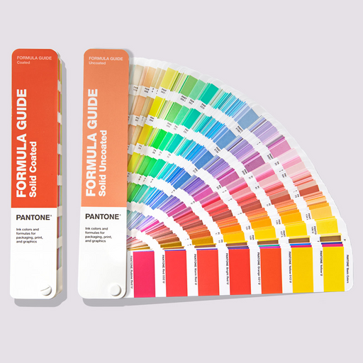
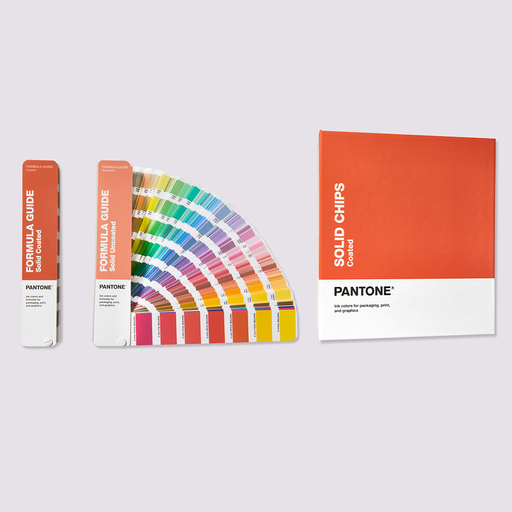
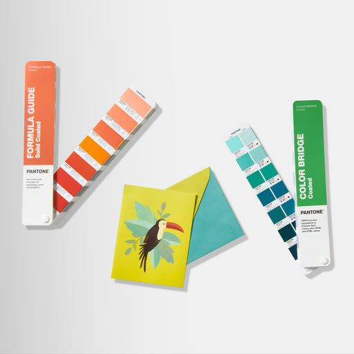
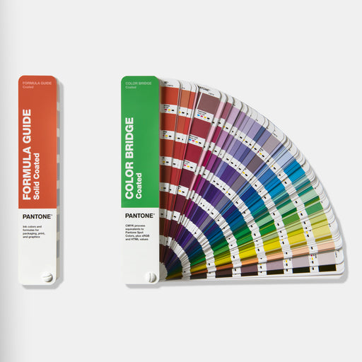
At the heart of the Pantone Matching System (PMS) are spot colors printed on paper. Why? Spot colors represent the truest representation of color intent in graphic art. Spot color printing, also known as spot or offset printing, is the process of formulating a single color and then applying it through the printing process. The Pantone Formula Guide is the only color guide that contains these color formulations.


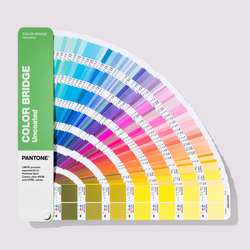
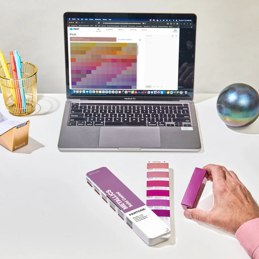
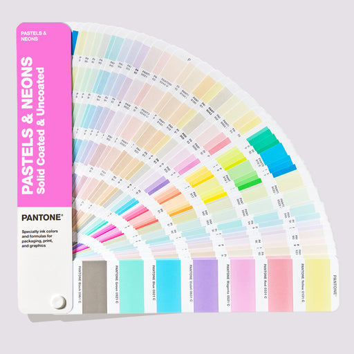
The colors in the Pantone fans are arranged chromatically, which allows you to find exactly the color you want at a glance.

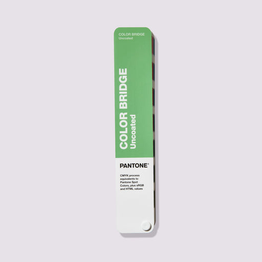
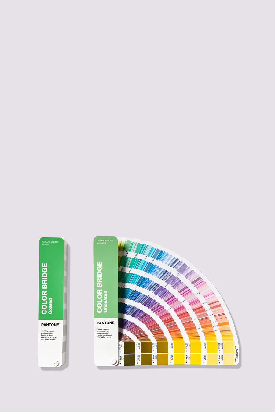
While we all know that spot color printing produces the most accurate results, we also know that it is the most expensive. That's why Pantone has developed a process color guide to help you achieve the closest possible approximation of PMS on a tight budget: the Color Bridge Guide . This guide provides a visual comparison of Pantone spot colors with their best CMYK process print counterparts. The Color Bridge is the only guide that contains CMYK, hex and RGB values for every single PMS color.
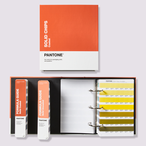
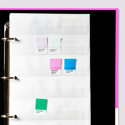
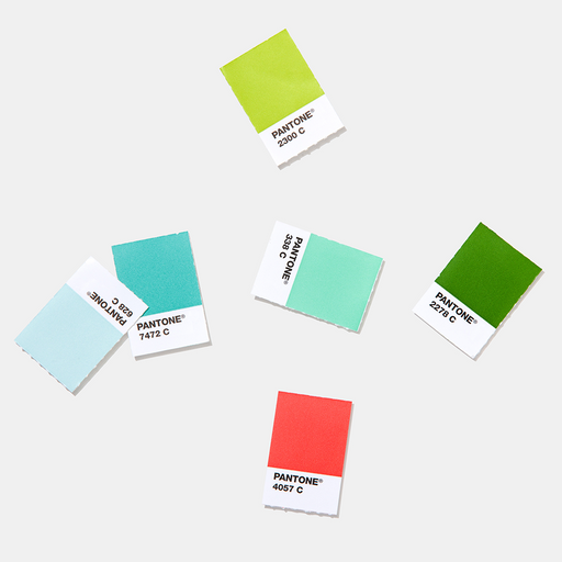
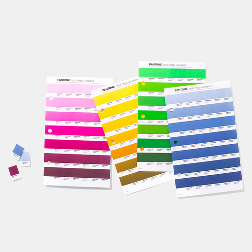
All PMS colors are also available as Plastic Chips to ensure consistent reproduction of your chosen color in all materials. The Plastic Chips are large enough to be digitally measured and also feature multiple surface textures and varying degrees of thickness.


Calibration tools allow you to reliably view the colors on your monitor, projector, and prints. We recommend using Calibrite calibration devices.
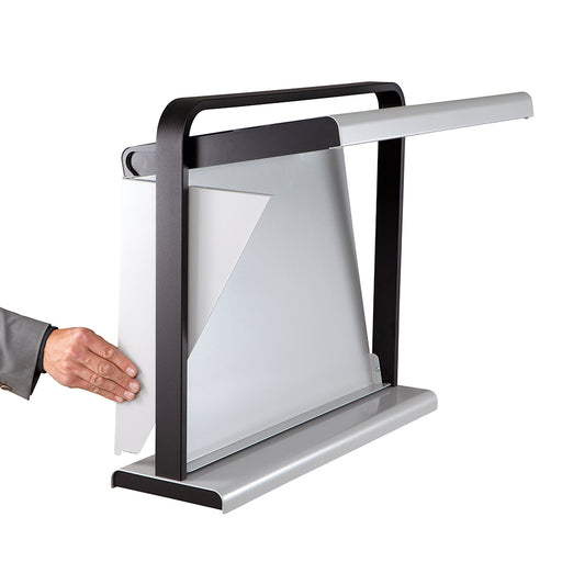
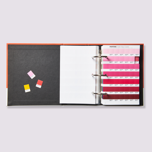
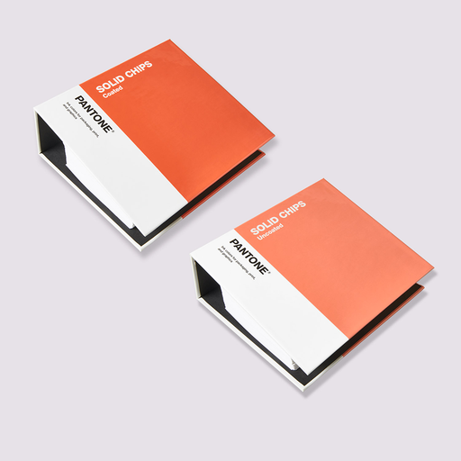
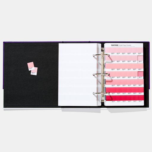
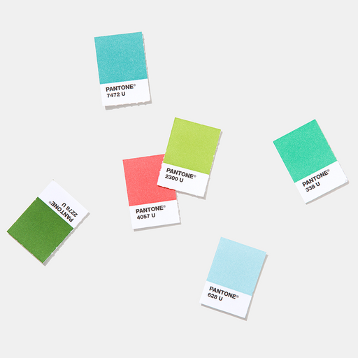
Perforated color chips allow you to work directly with your color palettes, giving you more confidence in your selection. We recommend that you always supply Pantone Solid Chips or Sticker Chips in the desired color along with the artwork and design files to ensure the exact color for the print output.


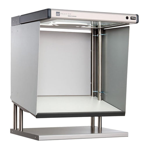
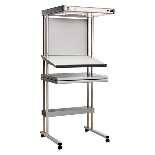
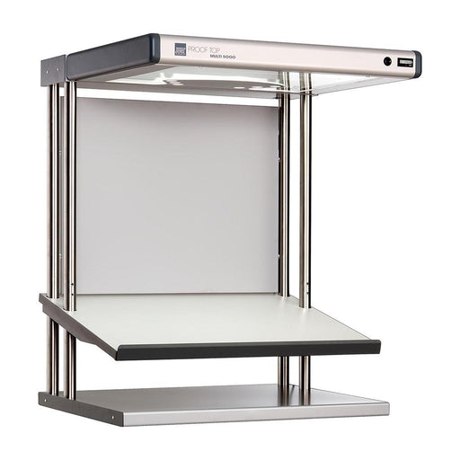
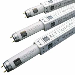
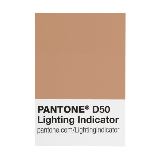
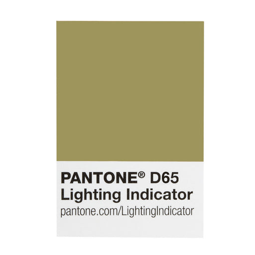
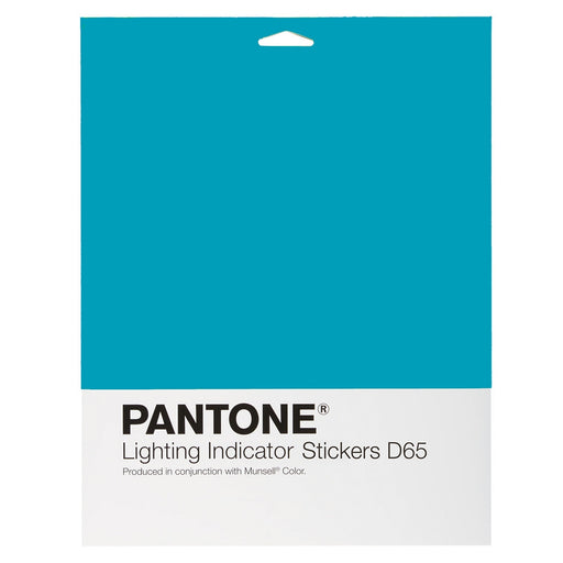
Light indicator stickers and light booths ensure that you always judge colors under correct conditions.
When performing color comparison within your product and print development projects, make sure you evaluate under the appropriate light source for the intended final production.
JUST colorFRAME The inexpensive entry into standard light technology – new design, easy operation and excellent illumination: JUST colorFrame. Idea...
View full detailsJust Normlicht LED proofTop Multi 0B with trolley stand This is a CtO product The general terms and conditions apply For color-critical ap...
View full detailsJust Normlicht LED proofTop Multi 0B This is a CtO product The general terms and conditions apply For color-critical applications, such as p...
View full detailsJust Normlicht Relamp Kit for Garment 5 Light Viewing Booth (item 200738)

COLOURS: Core colours, FORMAT: Colour fan, VALUES: Special colours

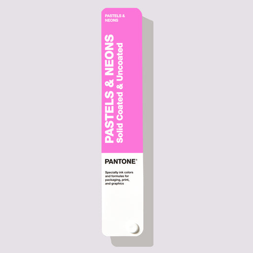
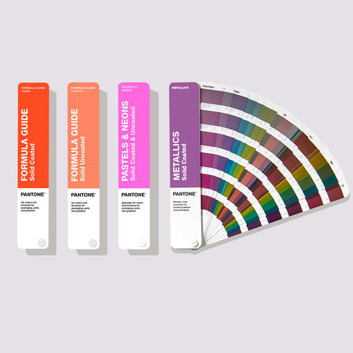
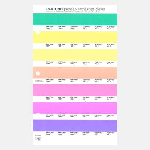
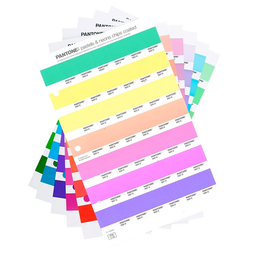
COLOURS: Pastels & Neons, FORMAT: Color fan, VALUES: Special colours.

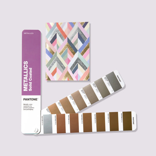
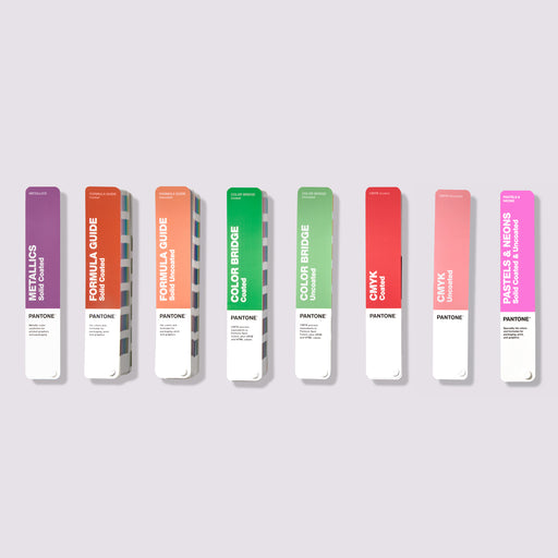
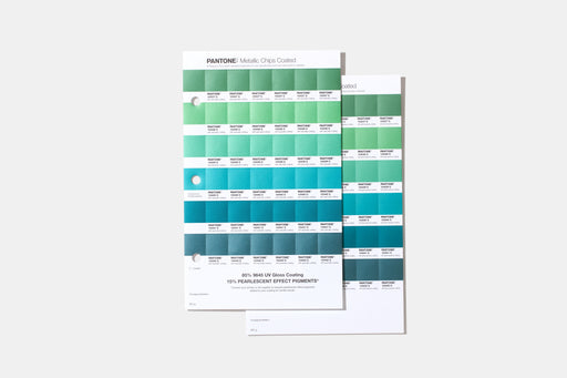
COLORS: Metallics, FORMAT: Color fan, VALUES: Special colors.
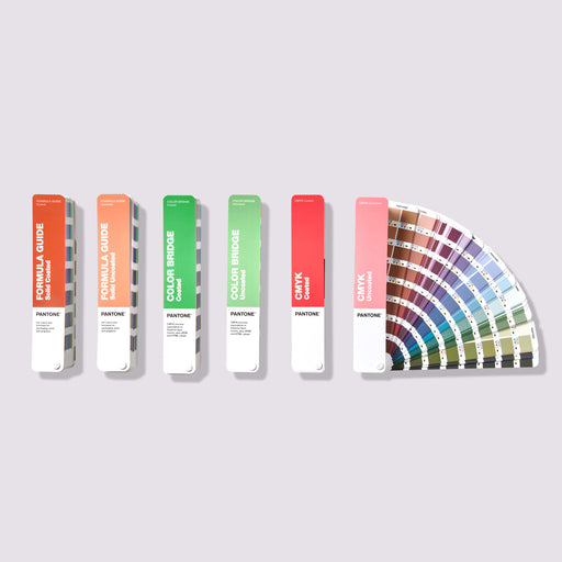
COLORS: Core colors, FORMAT: Color fan, VALUES: Spot & CMYK process colors.

COLORS: Core colors, FORMAT: Chips, VALUES: Special colors.

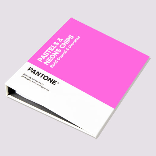
COLORS: Pastels & Neons, FORMAT: Chips, VALUES: Special colors
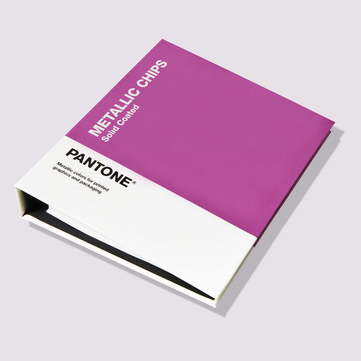
COLORS: Metallics, FORMAT: Chips, VALUES: Special colors.
Pantone Formula Guide Coated & Uncoated The ultimate color matching tool for communicating colors in graphics and print The new ve...
View full detailsPantone® Solid Color Set Pantone® color tools for all phases of your graphics workflow SKU GP1608B The Pantone Solid Color Set a...
View full detailsPantone Solid Color Chips Coated & Uncoated Shareable Pantone® color chips for graphics and printing Access the largest color spec...
View full detailsPantone Color Bridge Guide Set Coated & Uncoated With the Pantone Color Bridge Guide Set you can see the results of converting a Pantone...
View full detailsPantone Color Bridge Guide Coated The Pantone Color Bridge Guide Coated lets you see the results of converting a Pantone spot color to its...
View full detailsPantone Color Bridge Uncoated Use the Pantone Color Bridge Guide Uncoated to see the most accurate results of converting a Pantone spot color to i...
View full detailsPantone Coated Combo Get the ultimate color guides for color matching, comparison, communication and sharing. The Pantone Coated Combo is now avai...
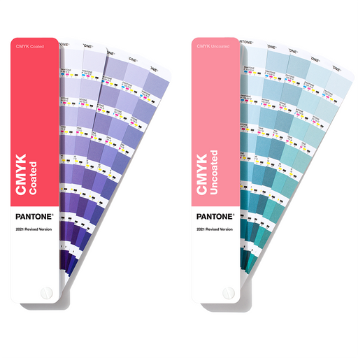
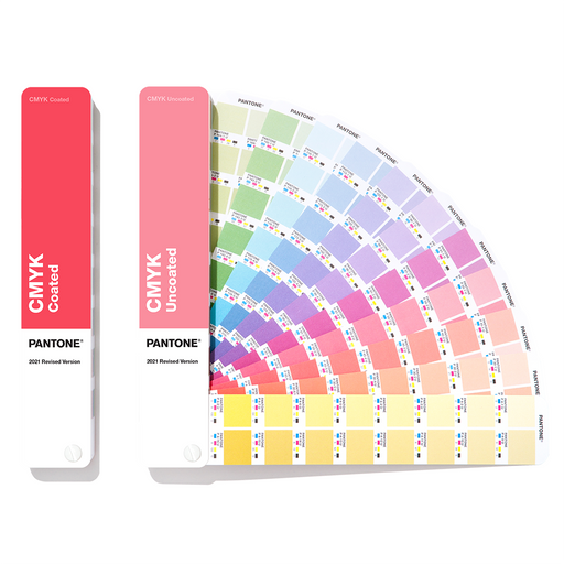
View full detailsPANTONE CMYK Guide Coated & Uncoated The latest PANTONE CMYK color guide helps you bring your designs to life with confidence. It contains 2...
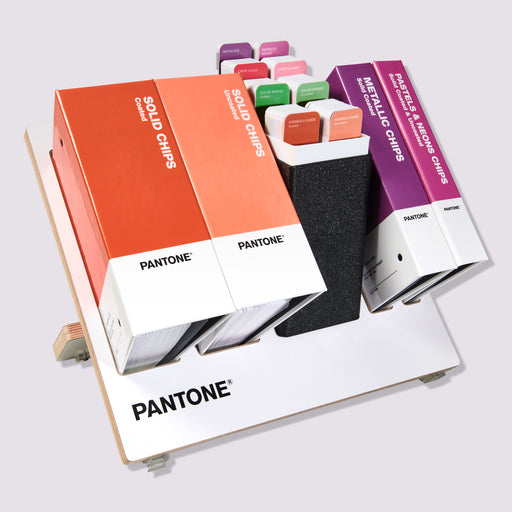
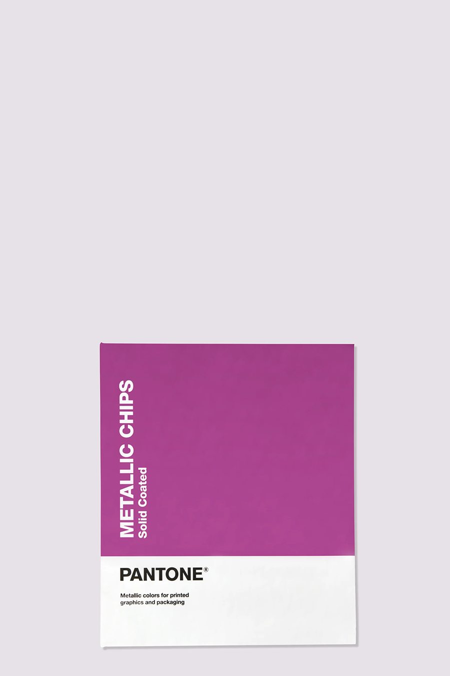
View full detailsPantone® Metallics Guide 655 metallic colors for printing and packaging Pantone metallic colors are now manufactured with environmentall...
View full detailsPantone® Metallic Chips Book 655 metallic colors for printing and packaging Pantone Metallic colors are now made with eco-friendly formul...
View full detailsPantone® Pastels & Neons Guide Coated & Uncoated More colors give you more choices for graphic colors that stand out Create more eye-catc...
View full detailsPantone® Pastel & Neon Chip Book Coated & Uncoated Expand the traditional color palette with pastel colors and neon tones Soft...
View full detailsPantone® Solid Guide Set Use the full range of Pantone® spot colors for graphics and printing Have the full range of Pantone® spot colors in one ...
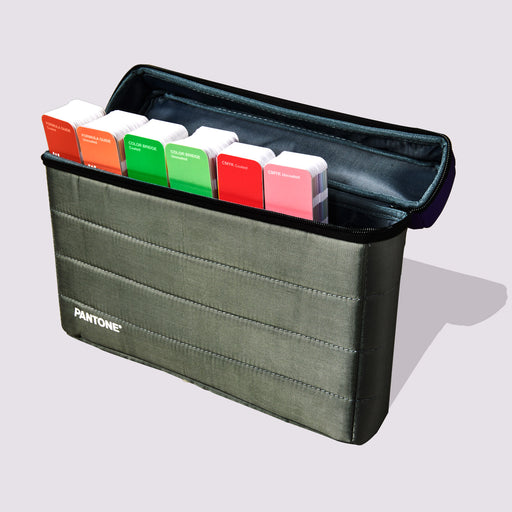
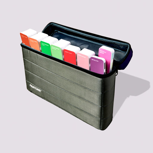
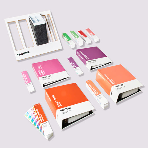
View full detailsPantone Essentials Guides Set Access six of Pantone's best-selling graphic tools in one compact carrying case. The Pantone Formula Guide, Color Br...
View full detailsPantone Portable Guide Studio Access all eight Pantone Graphic Color Guides in one sleek, portable case. The Pantone® Formula Guide, Color Bridge ...
View full detailsPantone Reference Library Access the full range of Pantone color resources in this convenient and comprehensive color collection. Easily browse, s...
View full detailsPANTONE Chip Replacement Pages Coated Removable chips to complement your coated Pantone graphics and print books. Keep your Pantone Chip Books...
View full detailsPANTONE Lighting Indicator Stickers D50 The PANTONE Lighting Indicator Stickers make it easy to view colors under the right lighting conditions...
View full detailsPANTONE Lighting Indicator Stickers D65 The PANTONE Lighting Indicator Stickers make it easy to view colors under the right lighting conditions...
View full detailsPANTONE Chip Replacement Pages Uncoated Removable chips to complement your uncoated Pantone graphic and print books. Keep your Pantone Chip Boo...
View full detailsPANTONE PLUS Pastels & Neons Chips Replacement Page Uncoated These replacement pages offer designers and printers an inexpensive way to use ...
View full detailsPANTONE Metallics Coated replacement pages Keep your PANTONE Metallic Chips Book up to date with the ability to purchase replacement chip pages ...
View full detailsPANTONE PLUS Pastels & Neons Chips Replacement Page Coated These replacement pages offer designers and printers an inexpensive way to use...
View full details{"one"=>"Select 2 or 3 items to compare", "other"=>"{{ count }} of 3 items selected"}