Packaging design plays a crucial role in the success of a product. While its primary purpose is to protect and preserve the product, its visual appeal significantly influences consumer behavior and brand perception. A central element in packaging design is color . The right choice of color can increase a product's appeal, promote brand recognition, and influence purchasing decisions. Let's explore why color is so important in packaging design and how PANTONE color guides can help designers achieve color accuracy and consistency across different materials and platforms to create a strong brand identity.
The Psychology of Color in Packaging Design
Color is more than just a visual element; it's a powerful psychological tool that can evoke emotions, convey messages, and influence consumer behavior. Studies have shown that up to 90% of spontaneous judgments about products can be based on color alone . Have you ever noticed how the color of a brand makes you feel? Here's how different colors can influence the perception of your product:
-
Red : Associated with excitement and urgency, often used in food packaging (e.g. McDonald's) to stimulate appetite.
-
Blue : Conveys trust and reliability, often seen in tech and healthcare brands (e.g. Nivea).
-
Green : Symbolizes nature and health, used by environmentally friendly companies such as Alnatura.
-
Yellow : Evokes happiness and optimism, ideal for brands that appeal to younger audiences (e.g. Crayola).
-
Black : Exudes luxury and elegance, used by premium brands such as Dior and Chanel.
Understanding the psychological impact of color is essential for designers who want to create packaging that resonates with the target audience and matches the brand identity.
The Role of Color Consistency
Color consistency across different packaging materials and platforms is critical to a strong brand identity. Inconsistent colors can:
- confusing customers
- Weakening the brand identity
- Reduce perceived product quality

Consider a brand that uses a particular color in its logo, online presence, and on its packaging. If two products on the shelf show slightly different shades, this could raise doubts about the brand's authenticity or attention to detail. This is where color management tools like PANTONE come into play.
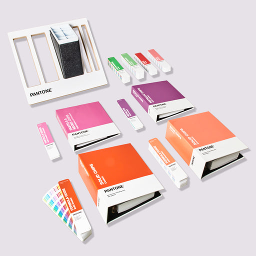
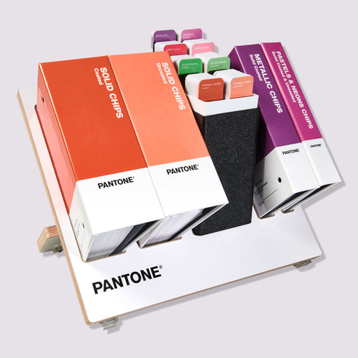
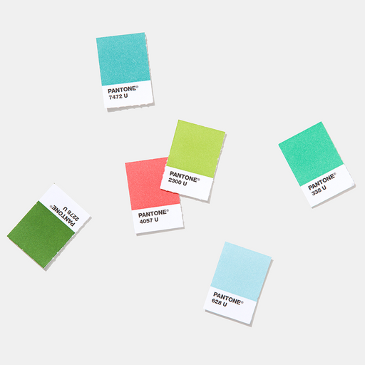
How PANTONE fans help in packaging design
PANTONE is a standardized color matching system that provides designers and manufacturers with a universal language to accurately communicate color.

-
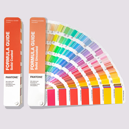
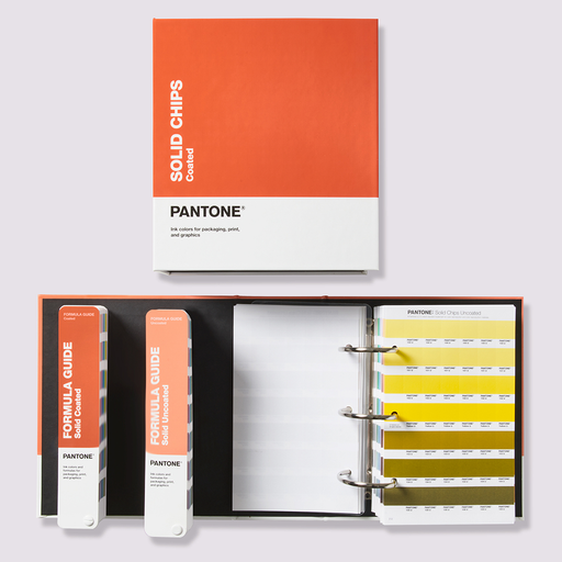
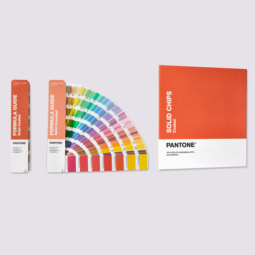
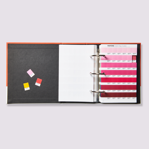
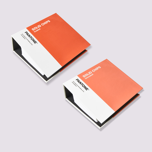
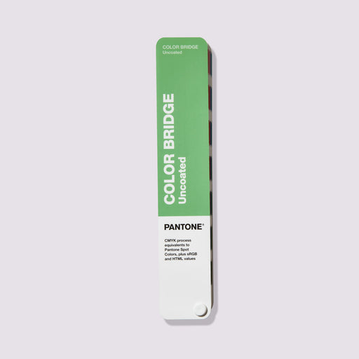
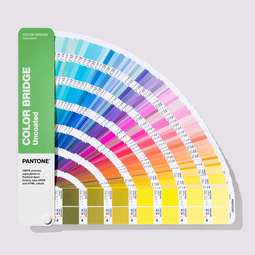
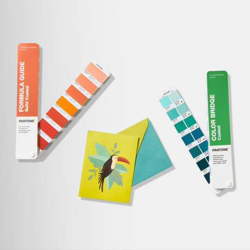
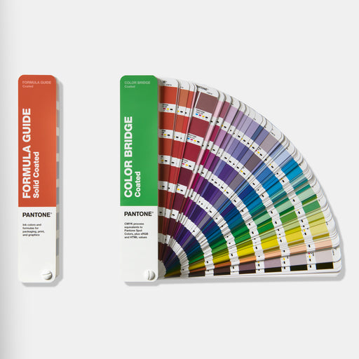
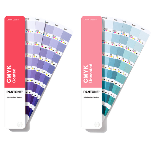
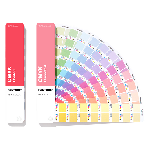
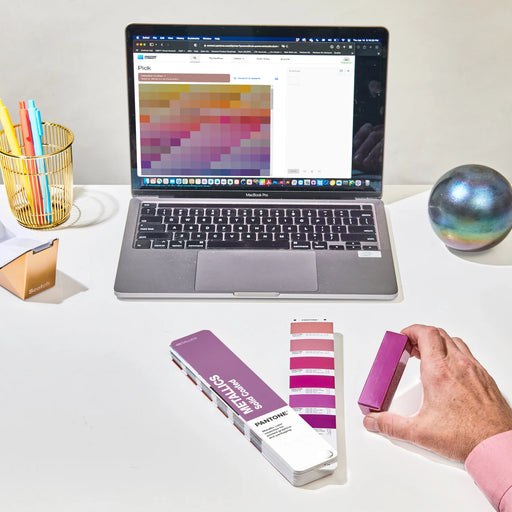
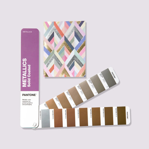
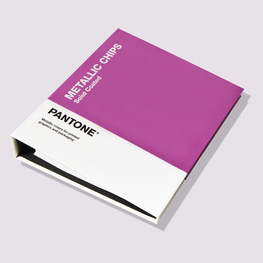
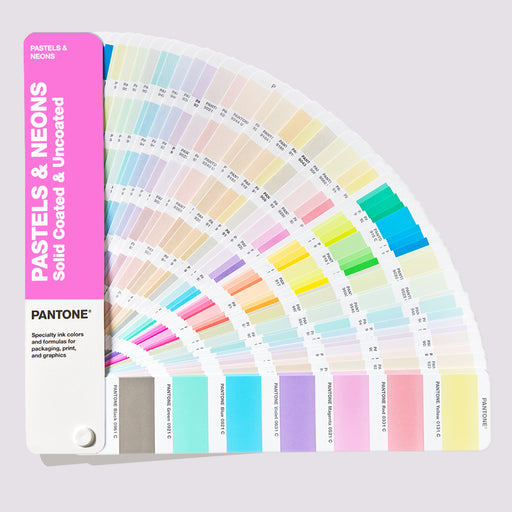
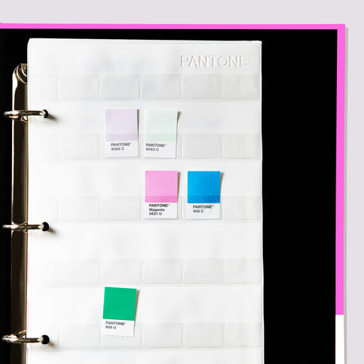
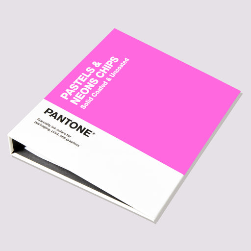
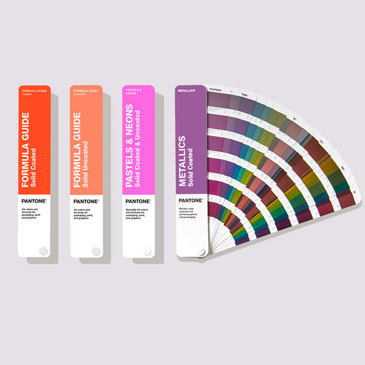
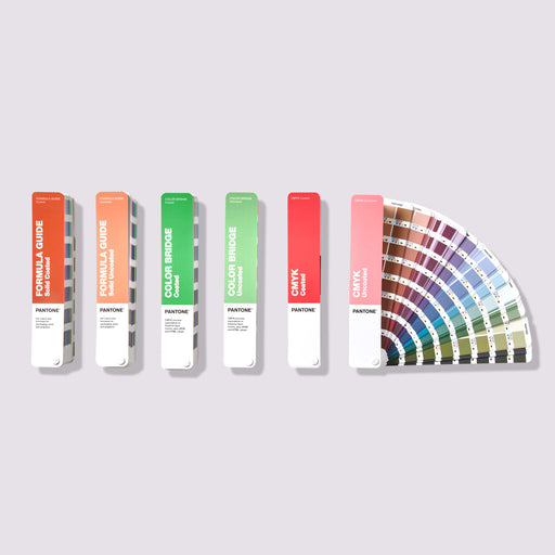
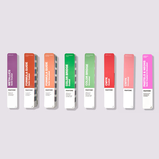
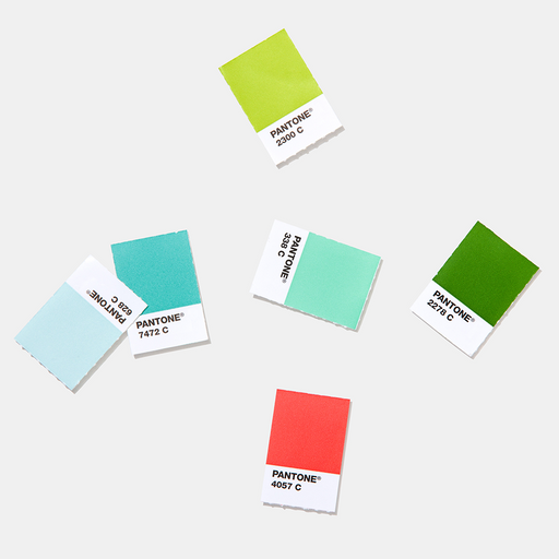
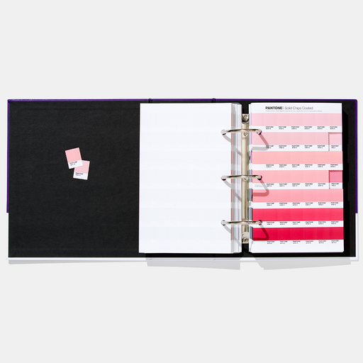
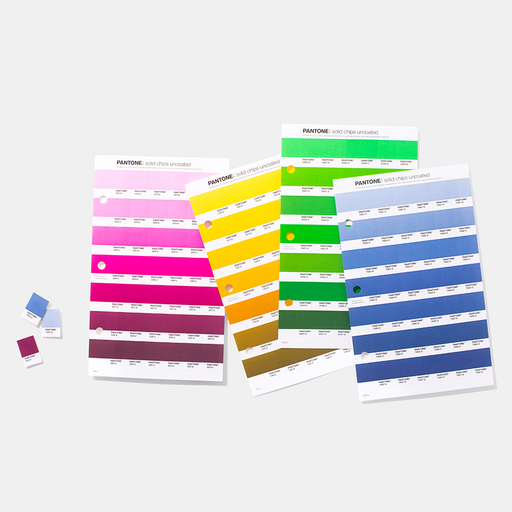
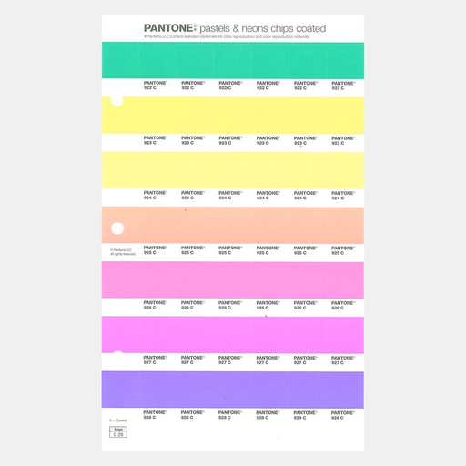
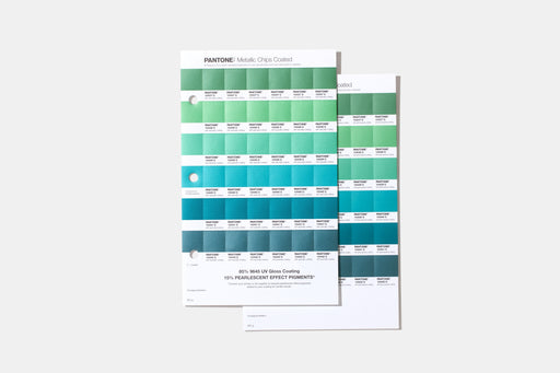
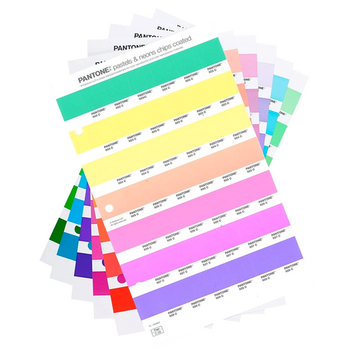
Color accuracy on different materials : Packaging uses different materials and processes. The PANTONE Formula Guide shows 2,390 solid colors on coated and uncoated paper, making it essential for offset and process printing . The Formula Guide is complemented by the Pastel, Neon and Metallic Guides , with 154 pastel shades, 56 neon shades and 54 metallic spot colors specifically for packaging design. The PANTONE Color Bridge Guide helps match solid colors to CMYK equivalents, ensuring consistent color on different materials such as paper, plastic and metal during printing.
-
Eco-Friendly Options : With the increasing demand for sustainability, PANTONE has introduced eco-friendly colors into their Formula Guide for print production to ensure your packaging design is both visually appealing and environmentally friendly.
-
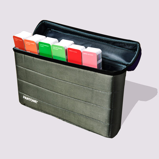
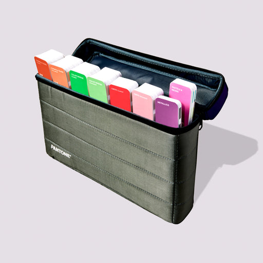
Versatility and portability : PANTONE fans are available in handy fan formats , making them easy to use anywhere. Whether you're in the design studio or at a print approval, these fans will provide you with a reliable color reference wherever you are.
-
Streamlined communication across teams : One of the biggest challenges in packaging design is ensuring consistent color throughout all stages of production. PANTONE guides serve as a universal color language, allowing designers to specify exact shades and avoid costly errors or reprints.

Case Study: Successful Use of Color in Packaging
A great example of effective use of color is Coca-Cola's iconic red packaging design. The bright red is now associated with the brand around the world. Here's why it works:
Emotional appeal : Red conveys energy, excitement and passion, which aligns with Coca-Cola's brand message of happiness and connection. It draws attention and inspires excitement, making consumers feel good about their purchase.
Psychological impact : Red stimulates appetite and creates urgency, making it perfect for food and beverage packaging. Coca-Cola's bold red encourages impulse purchases and makes consumers reach for a Coke without hesitation.
Consistency across platforms : Coca-Cola has used the same red for decades, which builds brand loyalty and trust. The consistent color creates an emotional connection and instant brand recognition across all platforms.
Cultural significance : Coca-Cola capitalizes on the global associations of red – excitement in the West and happiness in countries like China – ensuring that its packaging resonates with diverse audiences around the world.
Through the targeted use of red, Coca-Cola has created an emotional connection with consumers and built a globally recognized brand identity.
Conclusion

Color is a fundamental aspect of packaging design that directly influences consumer perception and brand success. By understanding color psychology and using tools like PANTONE fans , designers can ensure their packaging stands out while effectively communicating brand message and values. Whether you want to appear bold and energetic or calm and trustworthy, choosing the right colors and maintaining consistency across platforms is critical to creating packaging that resonates with your target audience and builds brand loyalty.
For designers looking to take their packaging design to the next level, PANTONE guides provide the accuracy, consistency and inspiration you need to make your products truly stand out.