Contact us
0800 776 2000
0800 776 2000

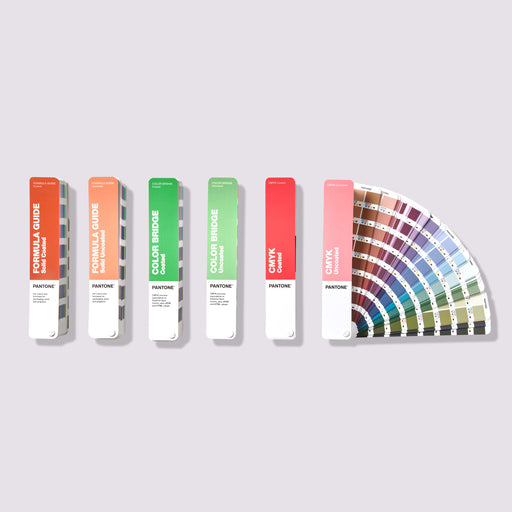
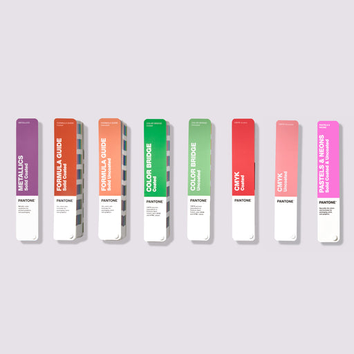
The printing process traditionally uses four colors: Cyan, Magenta, Yellow, and Black, which is known as CMYK printing. To access a wider range of colors in print, a fifth PANTONE color is added.
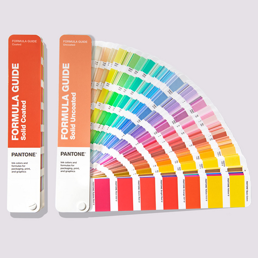
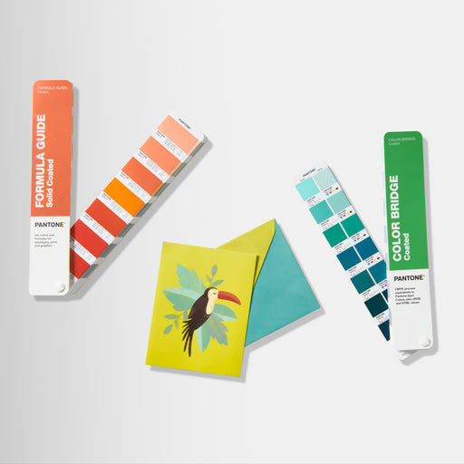
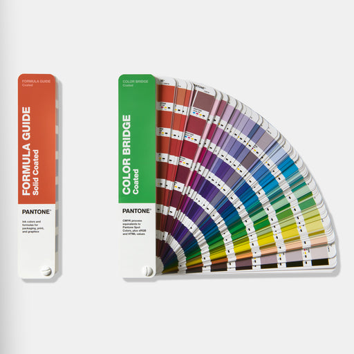
To create this PANTONE color for printing, we need the color formula. The PANTONE Formula Guide is used by printers and color manufacturers and contains all the formulas to produce these PANTONE colors.

At the beginning of the Formula Guide are a series of base colors. All subsequent colors in this guide are made up of formulas of these base colors in combination with a transparent medium.
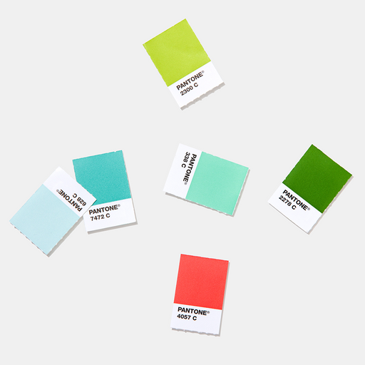
Next to each color is a standardized color code, for example, 2001 U. The first four digits are the standardized code for that particular color, and the U or C indicates whether the paper it is printed on is coated (C) or uncoated (U). If you already know the color identification number, you can use the included index to find the page number in the guide for that color.
In addition, there is a series of formulations printed next to the color, showing the ratio of each base color in combination with a transparent medium. All these values add up to 100, so each value shows the percentage of the base color within the total formula.

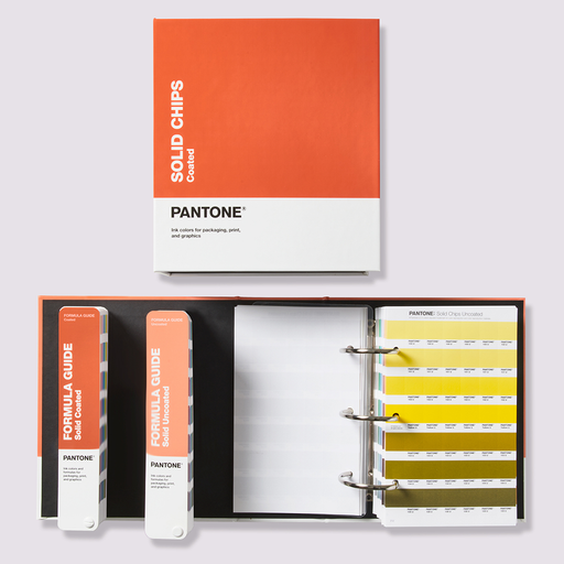
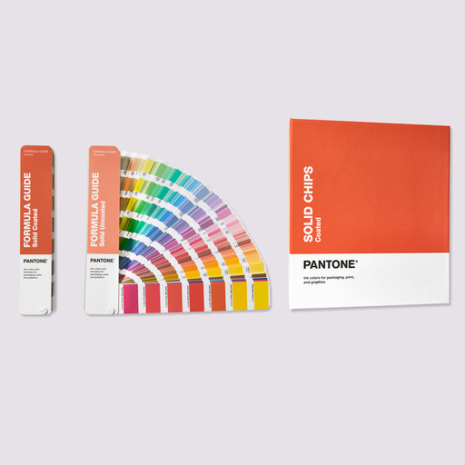
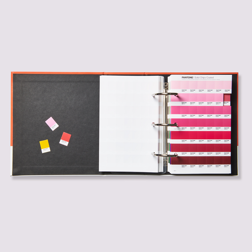
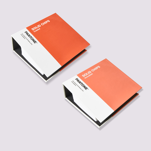
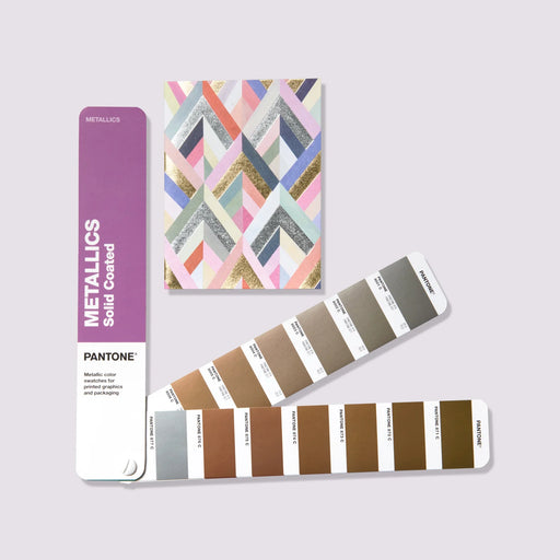
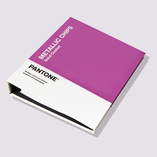
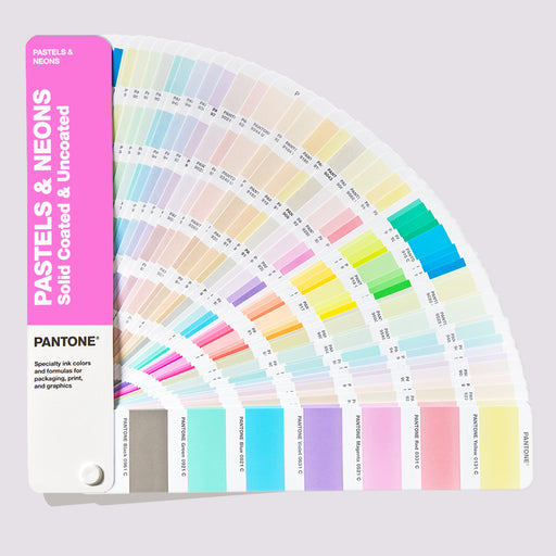
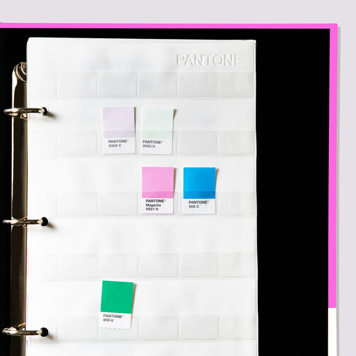
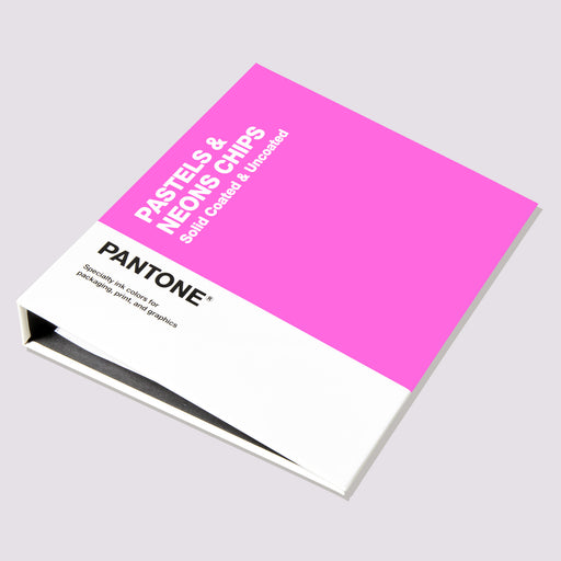
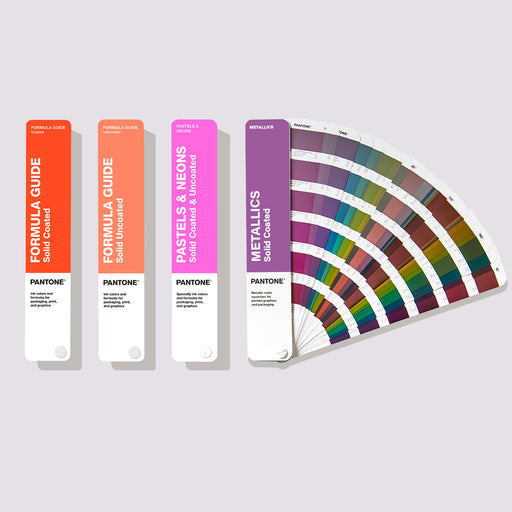
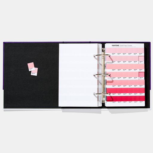
The Solid Chip Book contains the same colors as the Formula Guide, but these are available as removable swatches. These swatches can be detached and used as a communication tool or in mood boards. The Formula Guide, Solid Chips, Metallics & Pastels all come from the same color system and are available both as color fans and as removable chip books. The books show the color code, but the Formula Guide must be used to get the color formula.
For printers who regularly print with the same colors or need to produce colors quickly, a color scale is used, which immediately provides information about which basic colors need to be added for the desired color formula.

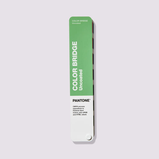
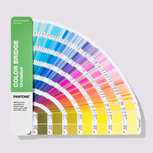
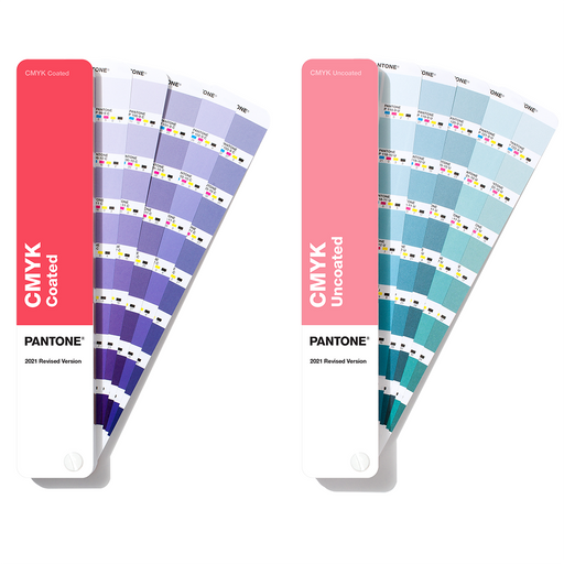
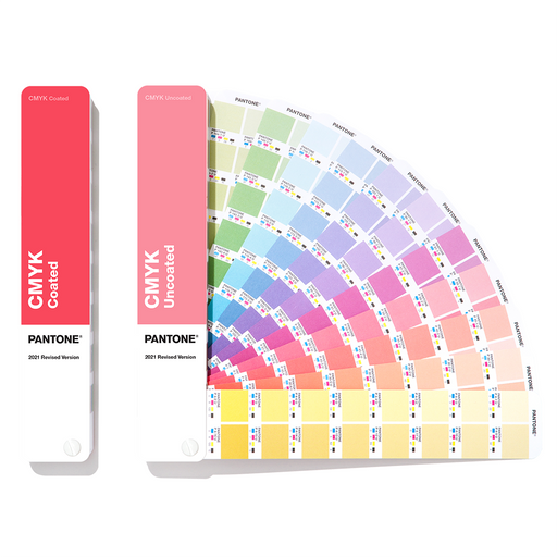
Designers use the PANTONE Color Bridge to coordinate their designs with the printed product at the print shop. The guide displays two versions of each color reference. The first shows the corresponding Pantone color (a smaller reference than that shown in the Formula Guide; furthermore, the color formula is not included here), and the second shows the closest color match that can be achieved with the four-color CMYK printing process, should one decide to use only standard CMYK printing. For some colors, the difference is small, while for other colors there is a clear visual difference between the original PANTONE color and the version that can only be achieved with CMYK colors. You can share the CMYK formula (for example, 0 49 84 0) included here with the print shop and have the required color produced.
When designing digitally, each color also displays its corresponding RGB values (Red, Green, Blue) that you can use when creating content in your chosen design software. For example: R 249 G 145 B 69. The HTML code used in web design, such as FA04BE, is also included. These values, in contrast to CMYK, are exact and not merely an approximation.
Pantone Formula Guide Coated & Uncoated The ultimate color matching tool for communicating colors in graphics and print The new ve...
View full detailsPantone® Solid Color Set Pantone® color tools for all phases of your graphics workflow SKU GP1608B The Pantone Solid Color Set a...
View full detailsPANTONE Formula Guide Set Coated and UncoatedThe essential physical reference for matching and specifying PANTONE spot colours.Choose, match and co...
View full detailsPantone Solid Color Chips Coated & Uncoated Shareable Pantone® color chips for graphics and printing Access the largest color spec...
View full detailsPantone Color Bridge Guide Set Coated & Uncoated With the Pantone Color Bridge Guide Set you can see the results of converting a Pantone...
View full detailsPantone Color Bridge Guide Coated The Pantone Color Bridge Guide Coated lets you see the results of converting a Pantone spot color to its...
View full detailsPantone Color Bridge Uncoated Use the Pantone Color Bridge Guide Uncoated to see the most accurate results of converting a Pantone spot color to i...
View full detailsPantone Coated Combo Get the ultimate color guides for color matching, comparison, communication and sharing. The Pantone Coated Combo is now avai...
View full detailsPANTONE CMYK Guide Coated & Uncoated The latest PANTONE CMYK color guide helps you bring your designs to life with confidence. It contains 2...
View full detailsPANTONE Color Bridge Guide Set Coated and UncoatedCompare PANTONE spot colours with their closest process and digital equivalents.Move from spot co...
View full detailsPantone® Metallics Guide 655 metallic colors for printing and packaging Pantone metallic colors are now manufactured with environmentall...
View full detailsPantone® Metallic Chips Book 655 metallic colors for printing and packaging Pantone Metallic colors are now made with eco-friendly formul...
View full detailsPANTONE Color Bridge Guide CoatedSee how PANTONE spot colours translate into coated CMYK print.Use the PANTONE® Color Bridge Guide Coated to co...
View full detailsPantone® Pastels & Neons Guide Coated & Uncoated More colors give you more choices for graphic colors that stand out Create more eye-catc...
View full detailsPantone® Pastel & Neon Chip Book Coated & Uncoated Expand the traditional color palette with pastel colors and neon tones Soft...
View full detailsPantone® Solid Guide Set Use the full range of Pantone® spot colors for graphics and printing Have the full range of Pantone® spot colors in one ...
View full detailsPANTONE Solid Guide SetFour fan guides with classic, metallic, pastel, and neon spot colors.The PANTONE® Solid Guide Set combines the most importan...
View full detailsPantone Essentials Guides Set Access six of Pantone's best-selling graphic tools in one compact carrying case. The Pantone Formula Guide, Color Br...
View full detailsPantone Portable Guide Studio Access all eight Pantone Graphic Color Guides in one sleek, portable case. The Pantone® Formula Guide, Color Bridge ...
View full detailsPANTONE Solid Chips Set Coated and UncoatedRemovable PANTONE colour chips for palette building, specification and approval.Create and share physica...
View full detailsPANTONE Color Bridge Guide UncoatedEvaluate PANTONE spot and process colours on uncoated paper.The PANTONE® Color Bridge Guide Uncoated shows h...
View full detailsPANTONE Chip Replacement Pages Coated Removable chips to complement your coated Pantone graphics and print books. Keep your Pantone Chip Books...
View full detailsPANTONE Lighting Indicator Stickers D50 The PANTONE Lighting Indicator Stickers make it easy to view colors under the right lighting conditions...
View full detailsPANTONE Coated Combo Formula Guide and Color BridgeTwo guides for coated paper to specify spot colors and compare process colors.The PANTONE® Coate...
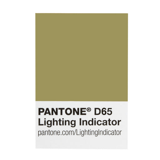
View full detailsPANTONE Lighting Indicator Stickers D65 The PANTONE Lighting Indicator Stickers make it easy to view colors under the right lighting conditions...
View full details
The PANTONE Plastics Products use the same color system as the Graphics products, for example 298C. C stands for Coated, which means the colors are applied to a coated surface.

The Fashion, Home + Interiors range includes the PANTONE FHI Guide and Specifier, as well as the Cotton, Polyester and Nylon ranges, printed on the corresponding fabric type.
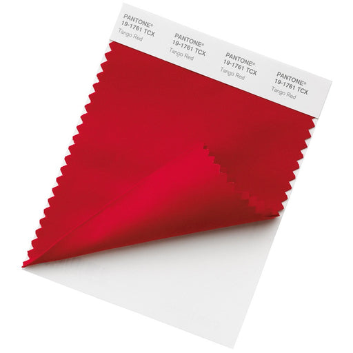
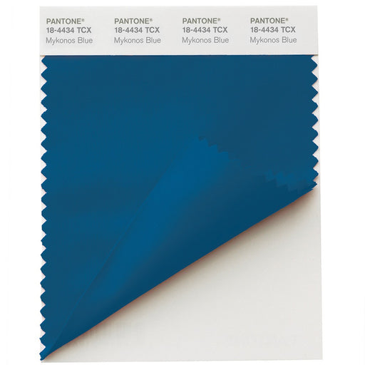
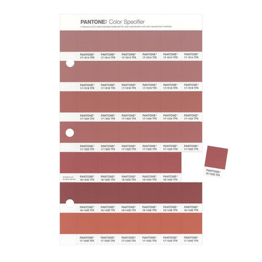
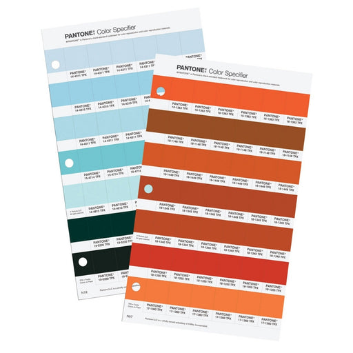
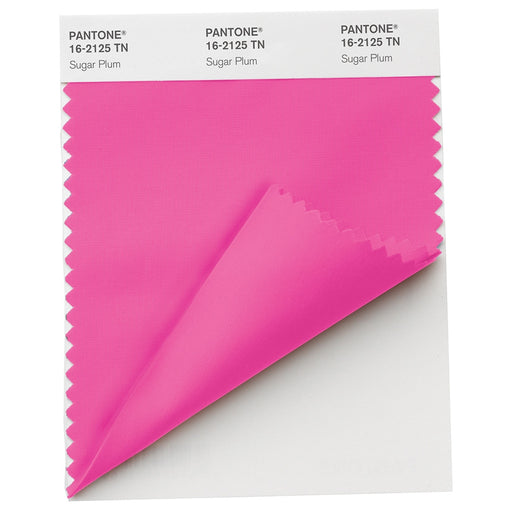
All products within the Fashion, Home + Interiors range use a six-digit code to define the color number, and a suffix (e.g., TCX, TPG, TPM) describing the material printed on. Within the six-digit code 11-0700 TPG, the first two digits define the lightness level of the color (between 11 and 19). The second pair of numbers indicates the hue. In total, there are 65 different hues, including 00, which represents the neutral point. The third sequence of digits represents the chroma level of the color, with 65 chroma levels, starting with 00 neutral.
When the same color appears in different FHI products, it shows the same six-digit code, with only the suffix changing depending on the material. The choice of guide depends on the material you are designing for and the size of the color swatch you need to reference, whether it's for cosmetics, fashion, product design, or home furnishings.
TPX = Textile Paper, indicating that the color reference is printed on paper. This was replaced by TPG when PANTONE updated their ink formulations to a more eco-friendly alternative.
TPG = Textile Paper Green, indicating that the color reference is printed on eco-friendly paper. The FHI Color Guide & Specifier uses this suffix.
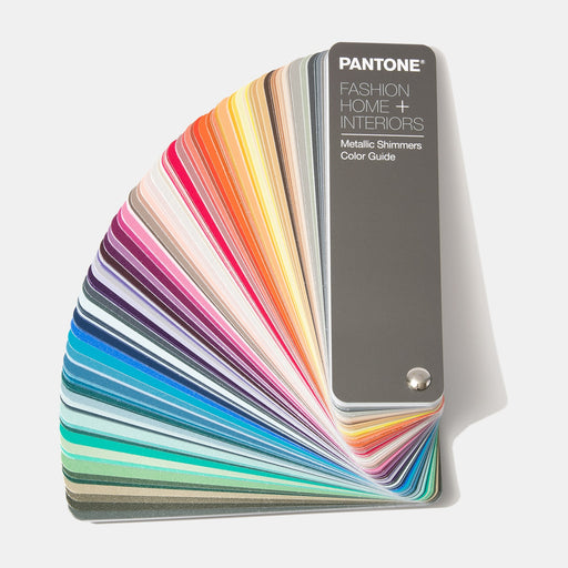
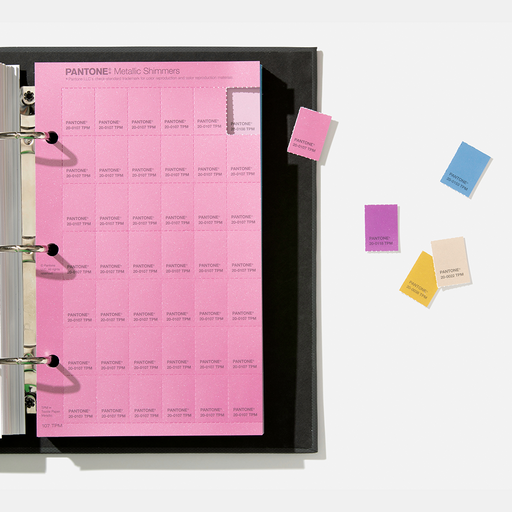
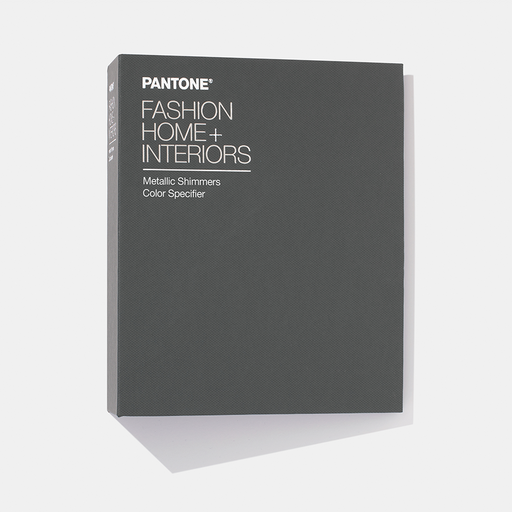
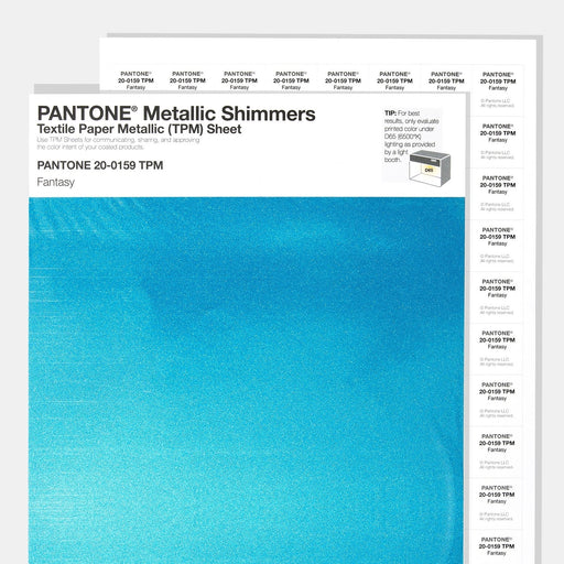
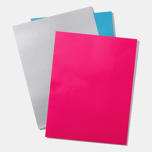
TPM = Textile Paper Metallic, indicating that the metallic color reference is printed on paper. This is used for the FHI Metallic Shimmers Guide and Specifier.
TCX = Textile Cotton Extended, indicating that the color reference is printed on cotton. This suffix is used for the entire PANTONE FHI Cotton range, including the Cotton Passport, Planner, Chip Set, and Swatch Library, all of which show the same colors in different swatch sizes.
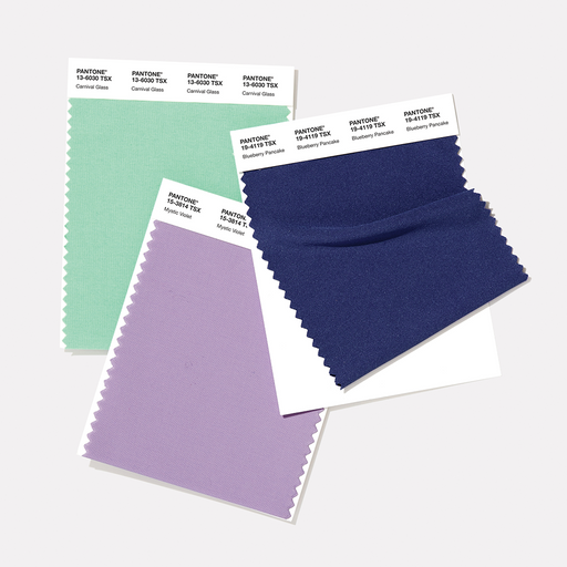
TSX = Textile Synthetics Extended, indicating that the color reference is printed on polyester, as with the Polyester Swatch Card.
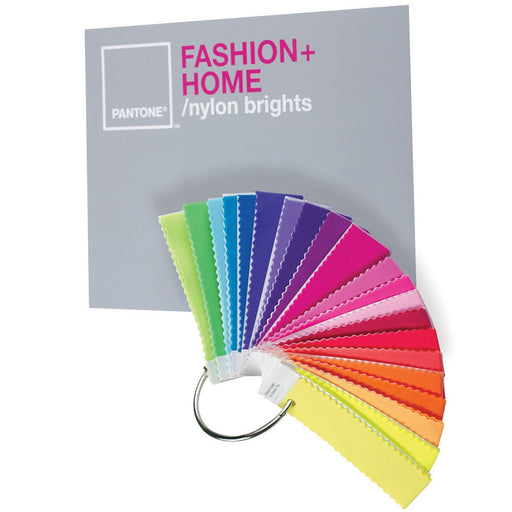
TN = Textiles Nylon, which shows the color references printed on nylon, as with the FHI Nylon Brights Set.
PANTONE FHI Color Guide & Dualities Expansion Pack Wearable inspiration from all 2,800 FHI colors. MPN FHIP110C Presented in an elegant ...
View full detailsPANTONE FHI Color Guide Dualities Expansion Pack For endless design inspiration on-the-go MPN FHIP120C Get the handy color chart with enviro...
View full detailsPANTONE FHI Color Specifier & Dualities Expansion Pack 2,800 removable paper chips for easy collaboration and specification. MPN FHIP210C ...
View full detailsPANTONE FHI Color Specifier & Guide & Dualities Expansion Pack Maximum color inspiration and collaboration with 2,800 removable chips. ...
View full detailsPANTONE FHI Cotton Passport & Dualities Expansion Pack All 2,800 Pantone FHI colors in the palm of your hand. MPN FHIC200C Discover Pant...
View full detailsPANTONE FHI Cotton Planner & Dualities Expansion Pack MPN FHIC300C Experience the comprehensive collection of large patterns with the FHI ...
View full detailsPANTONE FHI Cotton Chip Set & Dualities Expansion Pack MPN FHIC400C Discover Pantone's comprehensive collection with the FHI Cotton Chip S...
View full detailsPANTONE FHI Cotton Swatch Library & Dualities Expansion Pack 2,800 removable patterns make this library the ultimate reference for textiles,...
View full detailsPantone Limited Edition SkinTone Guide This is a CtO product - Terms and Conditions apply A collection of 138 skin tones Introducing the revolut...
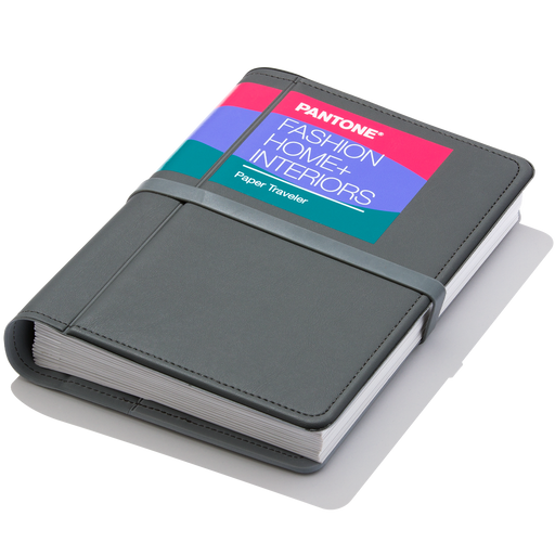
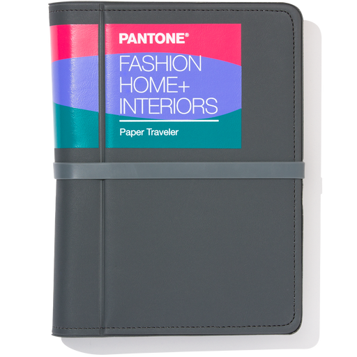
View full detailsPANTONE Fashion, Home + Interiors (FHI) Paper Traveler The Pantone Fashion, Home + Interiors Paper Traveler is designed to be taken to the office...
View full detailsFHI Metallic Shimmers Color Guide Our new Metallic Shimmers Color Guide adds 200 NEW colors to the Pantone Fashion, Home + Interiors System. Thi...
View full detailsPantone FHI Metallic Shimmers Color Specifier Our new Metallics Shimmers Color Specifier book adds 200 NEW colors to the Pantone Fashion, Home ...
View full detailsPANTONE FHI Large Paper Sample TPG Sheet MPN 1X-XXXXTPG Showcase your products in vibrant color with Pantone's large paper swatches, designed ...
View full detailsPantone FHI Metallic Shimmers TPM Sheet Our new Metallics Shimmers (TPM) single sheets add 200 NEW shades to the Pantone Fashion, Home + Interio...
View full detailsPolyester Swatch Cards Pantone Polyester Swatch Cards are the latest color standards for designers and product developers in the clothing, textile...
View full detailsPANTONE Cotton Swatch Cards 10 x 11cm double-layered, loose The swatch cards are made of dyed cotton fabric, which is attached to white cardboar...
View full detailsPANTONE FHI Color Specifier Replacement Pages (1 Pack) Update and replenish your favorite and most used FHI colors If you run out of certain...
View full detailsPANTONE Fashion & Home Nylon Brights Set Get your hands on our new rich brights Let your imagination run wild with our new collection of...
View full detailsLimited edition: FHI Color Guide with Color of the Year 2026 Set of two for furniture and fashion accessories The Fashion, Home + Interiors Color...
View full details
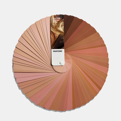
The PANTONE SkinTone Guide has a separate numbering system. Each four-digit number consists of two digits reflecting the hue and undertone of the skin, followed by a second set of digits representing the tone, lightness, and darkness of the skin from light to dark, for example, 1Y09 SP. The guide is primarily used in the fashion and beauty industries, as well as in digital game and video production, to ensure that realistic and diverse skin tones are accurately represented on screen.
{"one"=>"Select 2 or 3 items to compare", "other"=>"{{ count }} of 3 items selected"}