In the fast-paced world of design, staying current with the latest color trends is crucial. Whether you work in fashion, home furnishings, interior design, or graphics – up-to-date Pantone Colour Guides ensure that your creative work aligns with the latest trends and maintains color accuracy. Over time, even the highest quality color swatches begin to fade, which can compromise the integrity of your design and cost you time and money.
Why updating your Pantone Guides is important
Outdated color swatches lead to inaccurate colors – and this can cause costly mistakes. If the color you're referring to has faded or yellowed, it no longer matches what your clients or suppliers see. This leads to rework, new samples, and misunderstandings.
Pantone regularly updates its color palette to reflect global trends and market demands. If you haven't replaced your guide in the last 12–18 months, you could be missing out on hundreds of new colors. The Pantone FHI Guide , for example, now includes 2,800 colors – an essential update for anyone working with textiles or interior design.
The problem with fading and inaccurate color reproduction

Even with careful storage and handling, Pantone Colour Guides can be affected over time by the following factors:
- Handling: Oils from fingers can cause smudges and reduce color brilliance.
- Light exposure: Direct sunlight can cause colors to fade.
- Paper aging: As paper yellows over time, color accuracy decreases.
- Rubbing pages: This can scratch or wear down pigments.
- Humidity: Moisture can accelerate the aging process.
These factors mean that what you see in an old Pantone Guide may not match what your manufacturer actually produces – resulting in expensive reprints or even rejected products. Regular replacement of your color swatches is therefore crucial to ensure your designs remain precise and on-trend.
How FHI and Formula Guides keep you on track
Pantone is constantly evolving. Since the introduction of the Pantone Plus Series in 2010, over 750 new colors have been added. Staying up-to-date means not only having access to the latest colors – it also ensures that your work remains as precise and modern as possible.
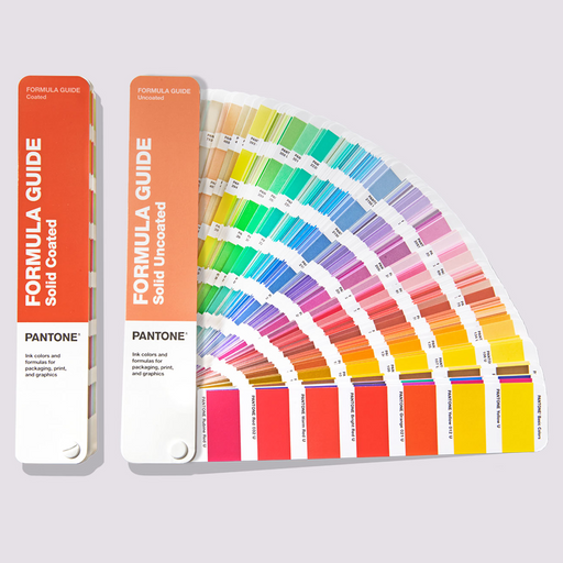
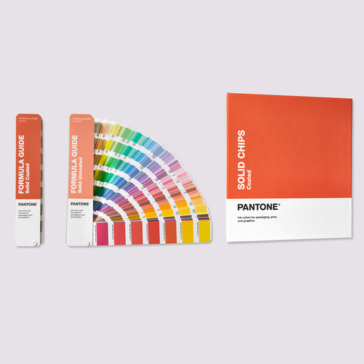
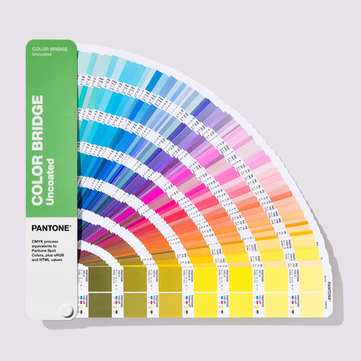
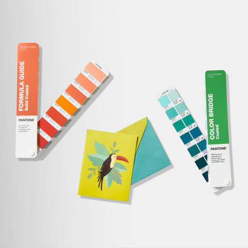
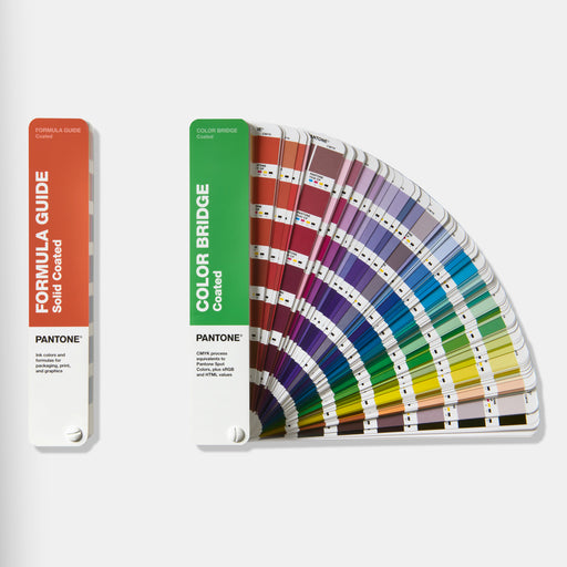
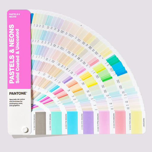
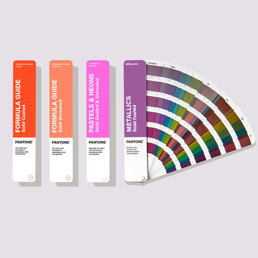
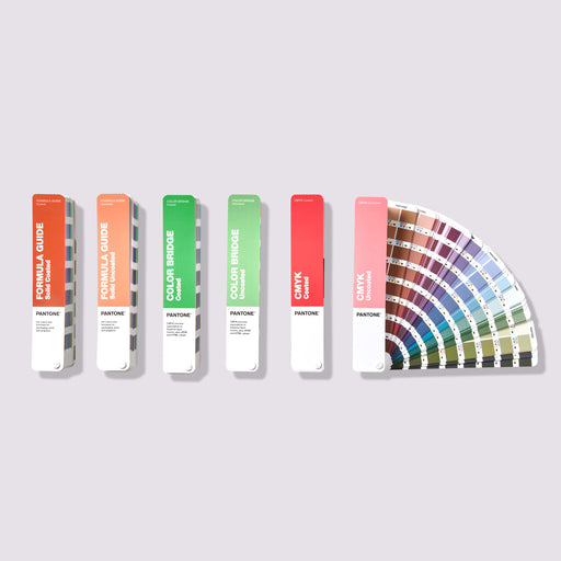
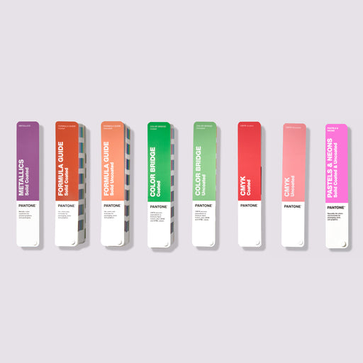
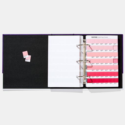
The Pantone FHI Guide was developed for professionals in fashion, home, and interior design, offering color accuracy that aligns with current design trends. It is an indispensable tool for working with the full spectrum of modern colors that customers expect today. The Pantone Formula Guide, on the other hand, is essential for graphic and print designers, ensuring that print results precisely match the intended colors.
What happens if colors don't match?
If your Pantone Guide is outdated, it can lead to significant problems for you and your team. Common challenges include:
- Misunderstandings: Your team and suppliers may not be referring to the same shade.
- Rework: Incorrect colors lead to additional rounds of samples or revisions.
- Production delays: Discrepant colors can delay product approvals.
- Additional costs: Reprints, resending proofs, and press checks quickly add up.
- Inconsistent brand impression: Colors that don't match across different materials damage your brand identity.
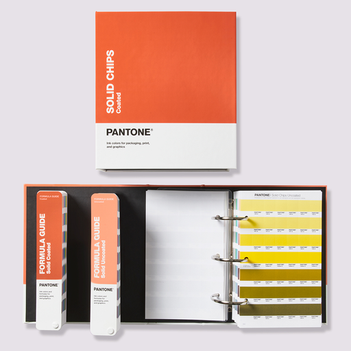
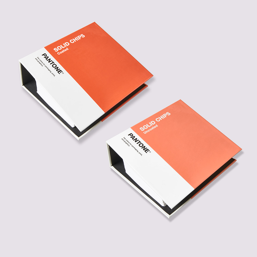
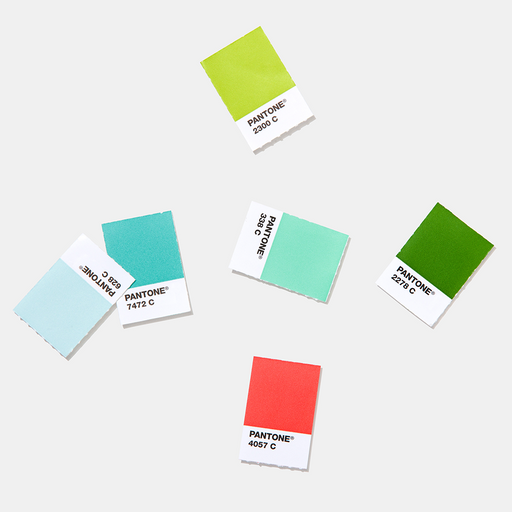
Pantone Solid Chips, Sticker Chips, and Super Chips were developed to bridge this gap. With these products, you can share physical color references with your production partners – ensuring everyone is literally working with the same color specification.
Solid Chips and On-Demand Color Solutions
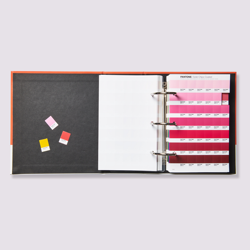
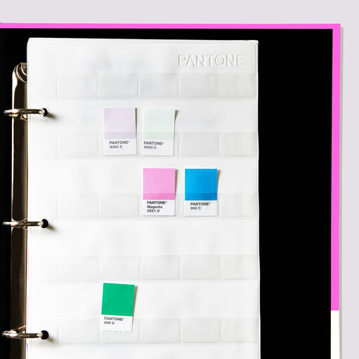
If you're concerned that your suppliers aren't working with the most current guides, Pantone Solid Chips are an ideal solution. These chips allow you to provide a physical representation of your desired color, ensuring consistency from design to production. Each chip can be easily attached to layouts or shared with your printer to avoid color discrepancies.
Pantone On-Demand Prints offer even more flexibility: you can order Sticker Chips or Super Chips for specific colors. These formats can be easily attached to design files, sketchbooks, or presentations. With 35 Sticker Chips per sheet or large 2.5” × 3.8” chips, you have all the tools at hand to communicate colors precisely.

Stay one step ahead with Pantone color trends
Pantone is not just a color system – it is also a leading authority on color trends. The Pantone Color Institute provides insights into emerging color trends, influenced by fashion, art, new technologies, and societal developments. With the latest Pantone Guides, you not only stay up-to-date but also design with an eye to the future.
Ready to update your Pantone Guides?
If your Pantone Colour Guide has been on your desk for more than 18 months, it's time for an update. The latest guides – including the Pantone FHI Guide and the Pantone Formula Guide – ensure that your work remains as precise, vibrant, and trend-oriented as possible.
Don't wait for color problems to arise – act proactively to ensure your creative projects are implemented smoothly.
Do you need to update?
Discover the latest Pantone Guides now to keep your designs precise, consistent, and always a step ahead.